Richardson Wealth
Our new client, Richardson Wealth, needed a redesign of their website to better attract financial advisors and appeal to prospective clients.
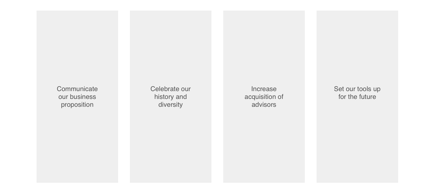
Their website needed alignment with their core experience pillars and it was our mission to help them get there with a new design that highlights the strong personal relationships integral to Richardson Wealth.
Role
Senior Visual Designer & Art Director
Platform
Desktop & mobile
"As the leading independent wealth manager in Canada, we offer the personal touch of a boutique firm while delivering big results. We take the time to get to know your unique situation so we can start to create a plan tailored specifically to you that brings your vision of the future to life. Since 1857, the Richardson family has built a strong reputation for entrepreneurship, stability and achievement. Today, our iconic name is synonymous with intergenerational wealth."
Analysis
With the old design, some of the key design principles we wanted to improve on were:
Contrast
Hierarchy
White space
Competitive Analysis
CIBC, Canaccord Genuity, RBC
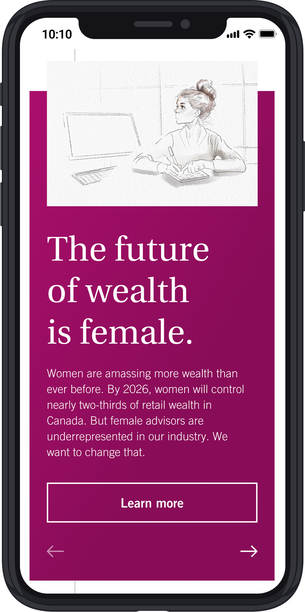
Major banks have begun highlighting diversity across their organizations unlike most smaller firms
Navigation across sites is intuitive and simple to find information for both advisors and clients
In 5 pages or less, most competitors clearly articulate their story and benefits.


Inspirations
Uber, Betterment, Wealthfront, Wealthsimple
Modern, clear design highlights human connection
Emphasize clearly articulated and tangible benefits for advisors
Highlight client benefits & experience as a selling point to advisors
Down-to-earth and personable yet professional tone of voice


Brand Book
Before we started concepting, we studied the brand book to understand the type of tones we could be delivering through different fonts and colours.
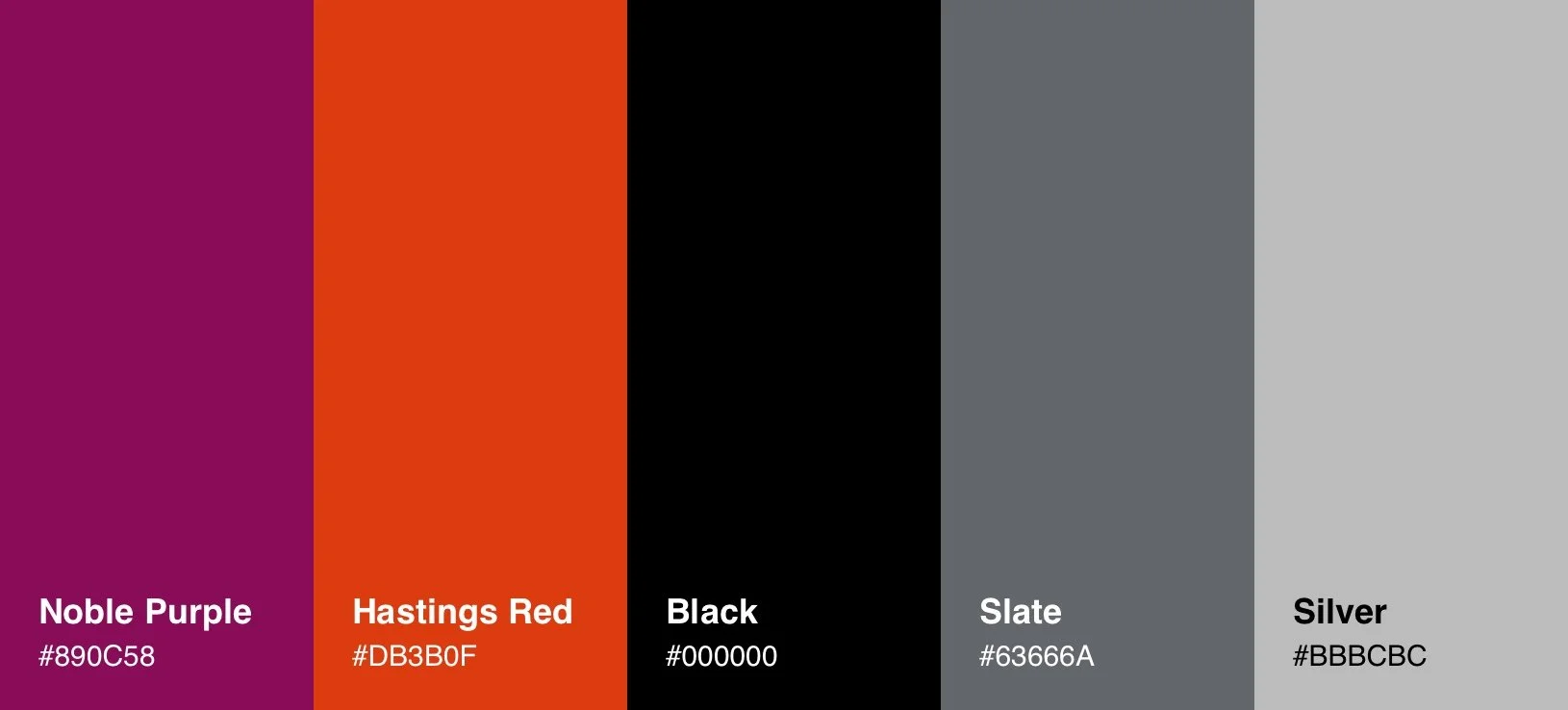
Noble Purple: What once might only be seen in a royal palace, this colour has become a staple identifier for political and industry leaders. Purple is a versatile colour, combining the confidence of red with the calming effect of blue.
Hastings Red: This accent red with a warm orange undertone brings an exciting rush to our brand, mirroring the passion underlying every facet of our business.
LOGO
COLOUR PALETTE

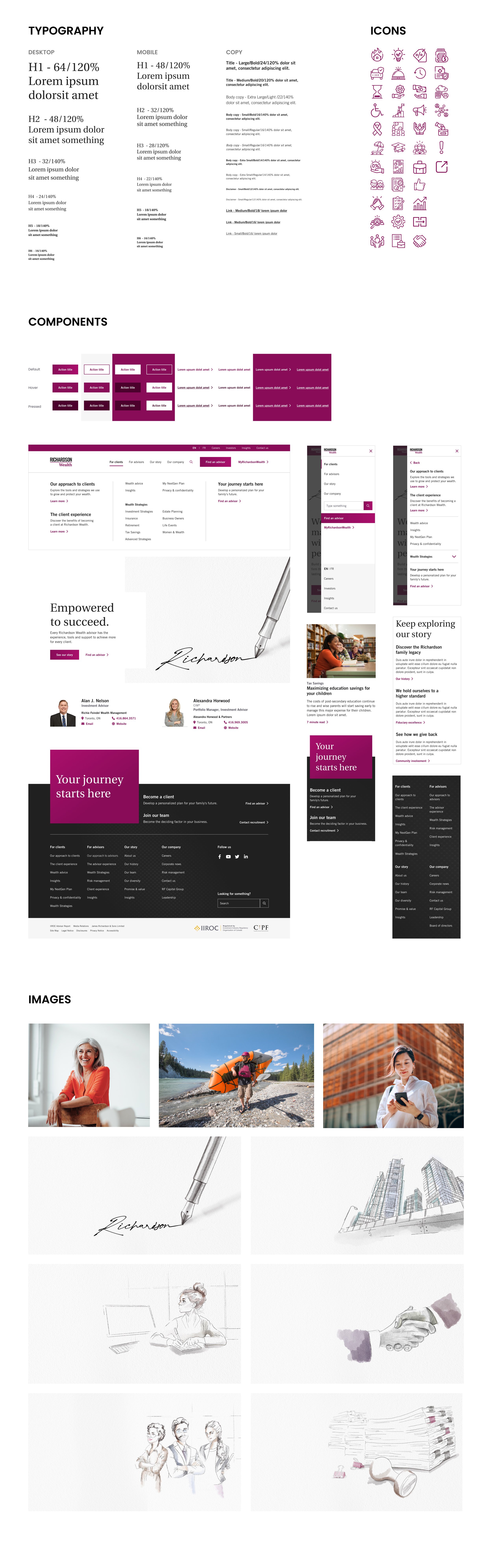
TYPOGRAPHY
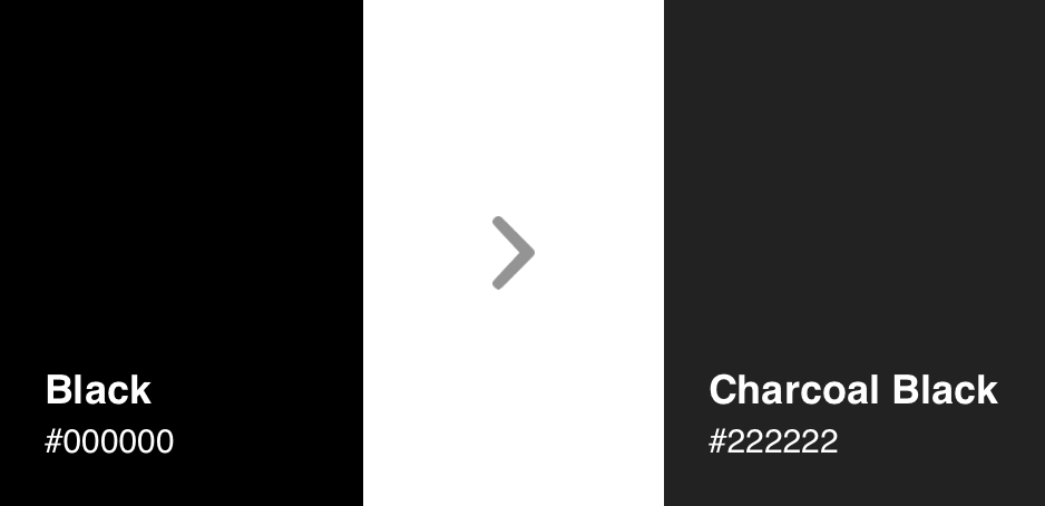
Since we were working with 2 very strong primary colours and a solid black - #000000, the overall look and feel of the brand felt too harsh. We decided to adjust the shade of the black to a charcoal black - #222222.
Concepting
During the concepting process, there were several elements that we noticed had a lot of potential:
Noble purple with a subtle gradient
Use of lines around the copy
Personalized illustrations and icons
Challenge
The main challenge that we dealt with on this project was the brand colours. Richardson Wealth has 2 primary colours, Noble Purple and Hastings Red, which don’t work well together. When used closely together, they are visually confusing and would compete with each other.
Our solution was to use the Noble Purple as the primary colour and incorporate the Hastings Red in photography.


Design System
Client Review - Round 1
Concept 1
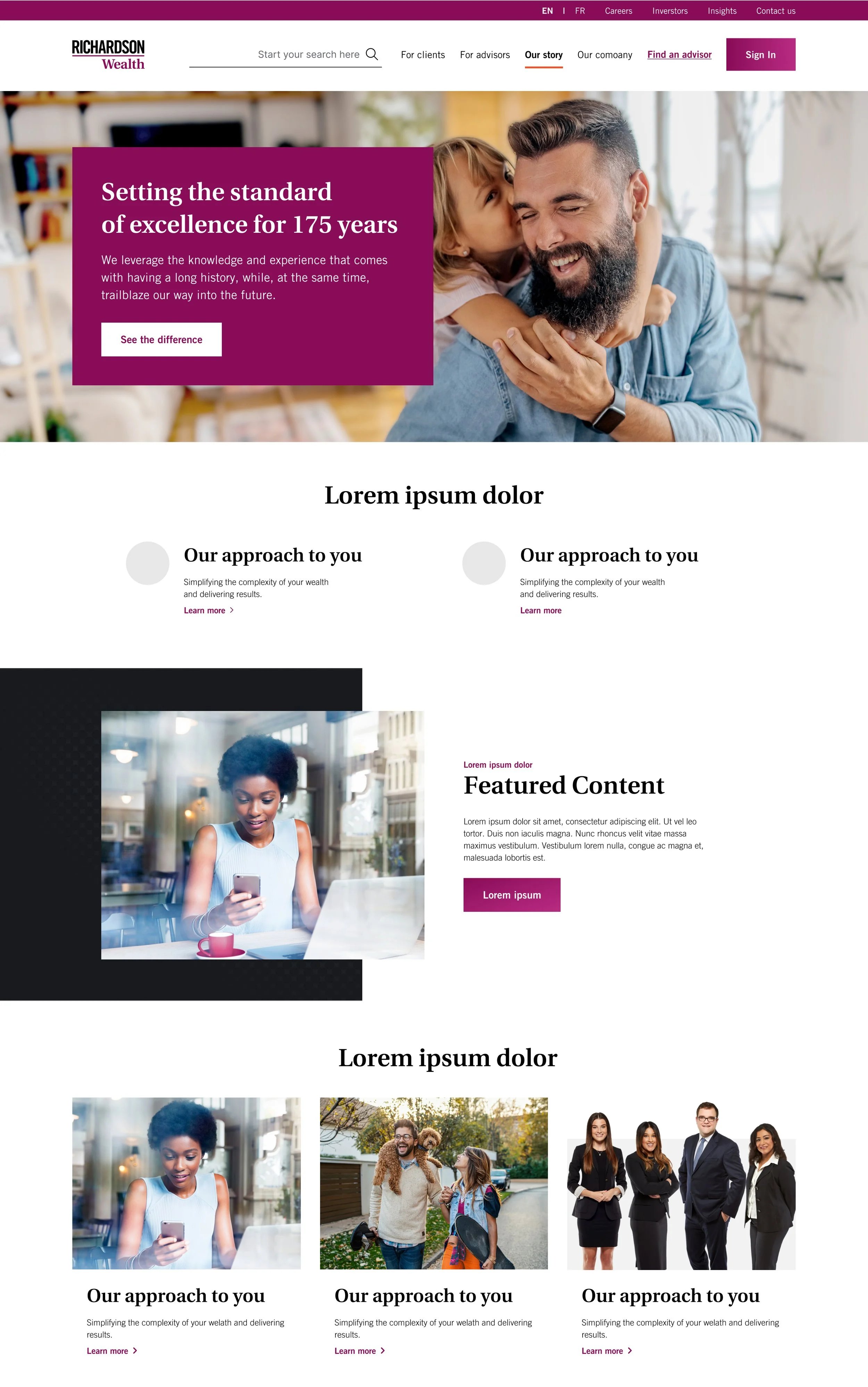
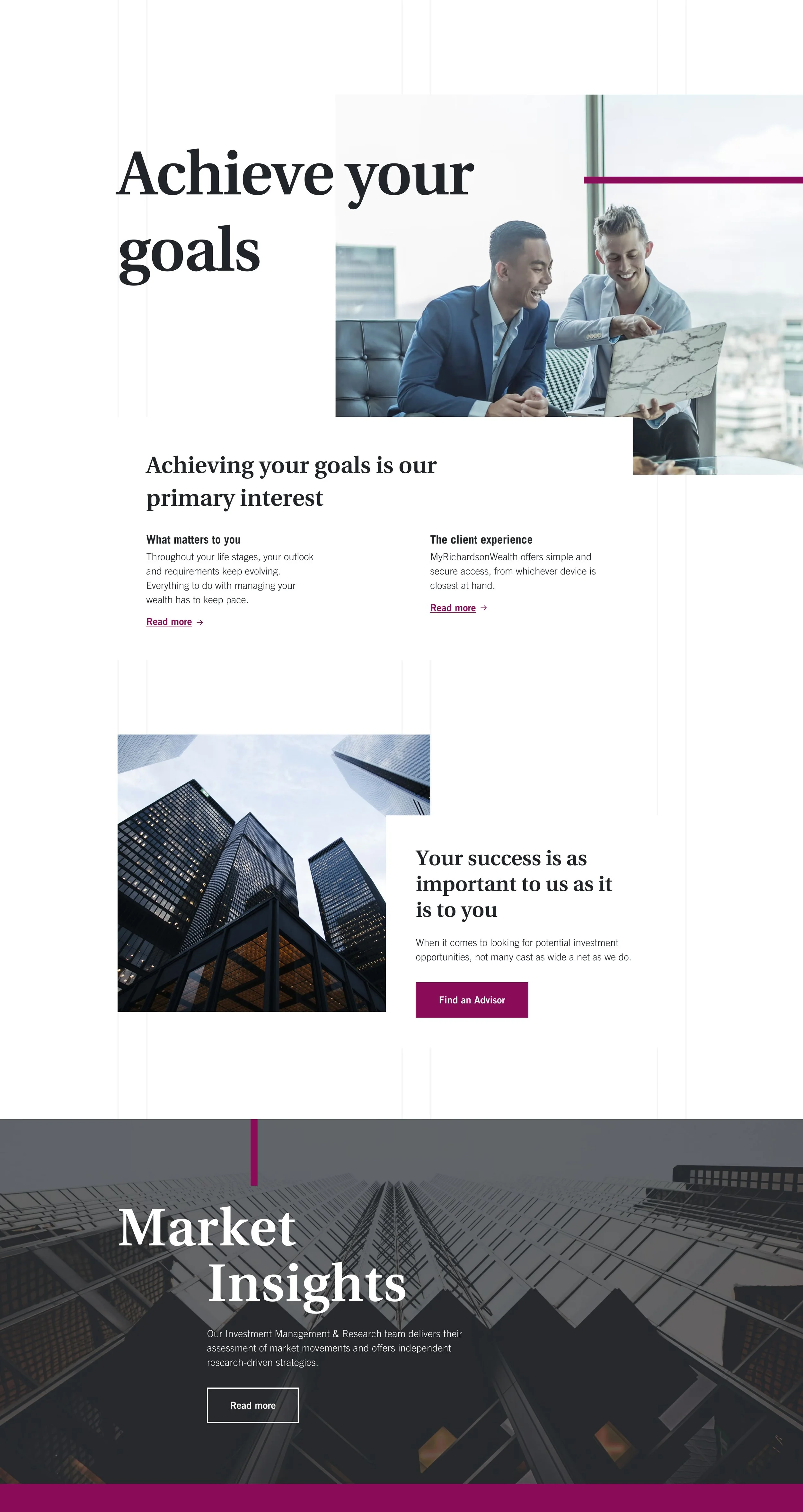
Theme: Power Statement
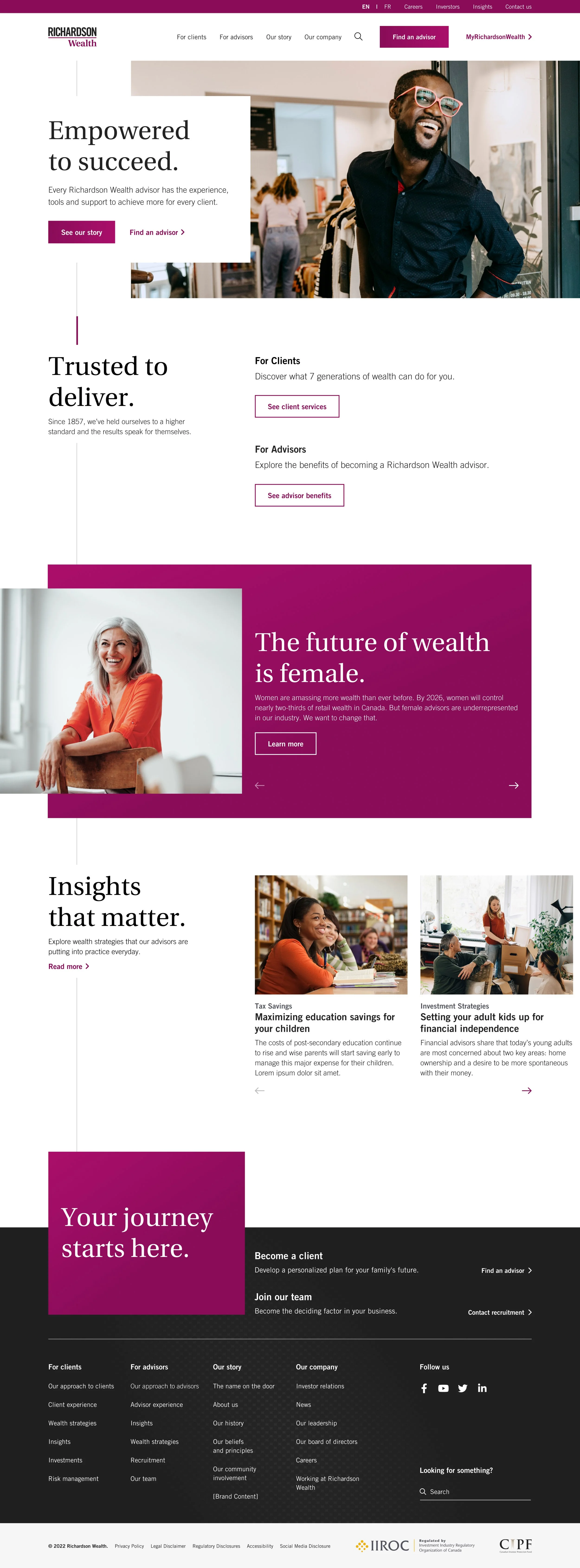
This concept makes a statement. Its language is bold, powerful and attention grabbing, while being advisor-forward and customer-centric. It’s a reflection of Richardson Wealth’s ‘game-changing’ culture and core beliefs.
Clean, minimal and focused, the layout allows the content to thrive, while subtle touches like the gradient in the noble purple blocks add to the premium feel.
The tailored pin stripe takes users on a journey, drawing attention to key actions throughout the experience.
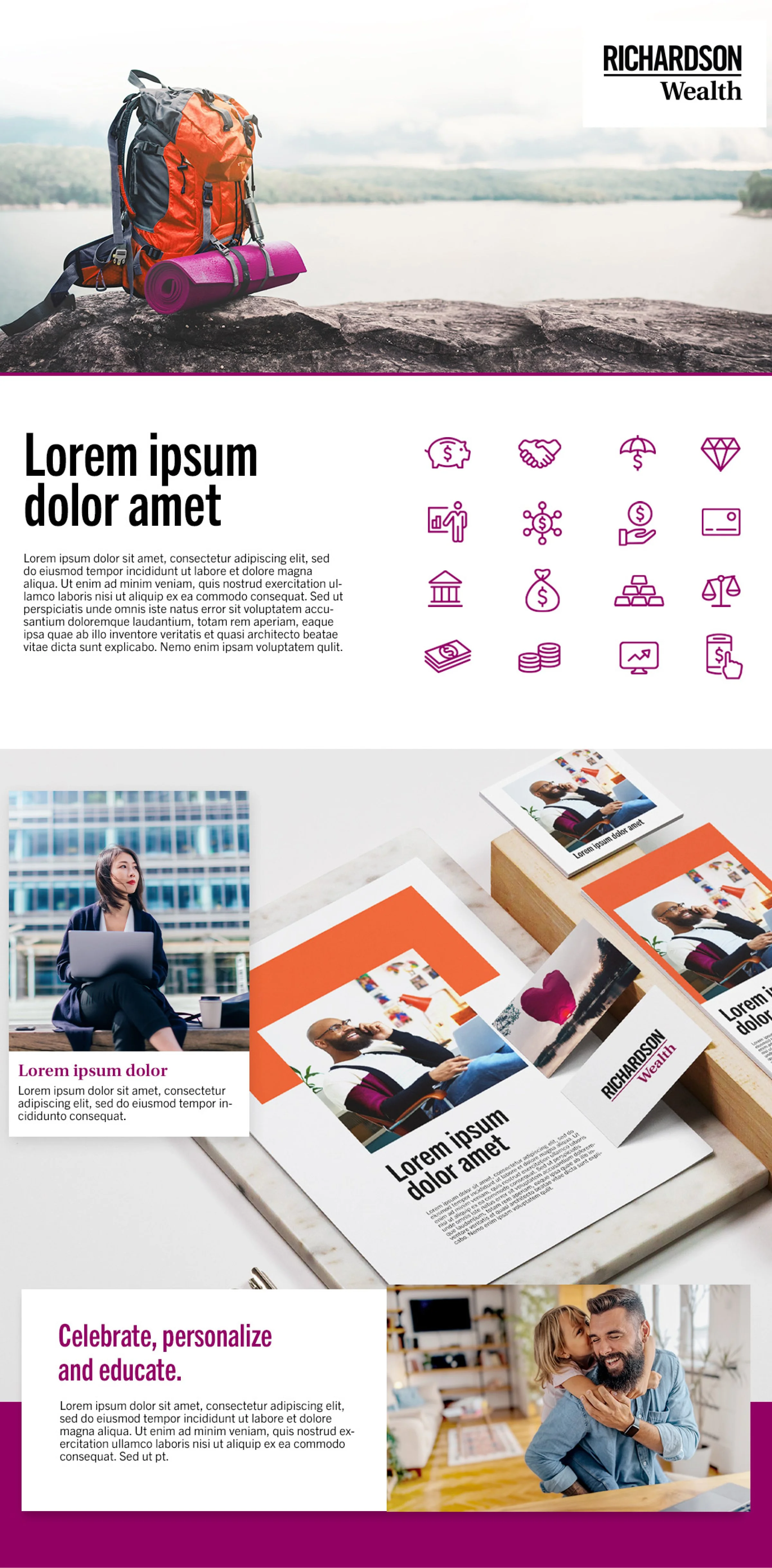
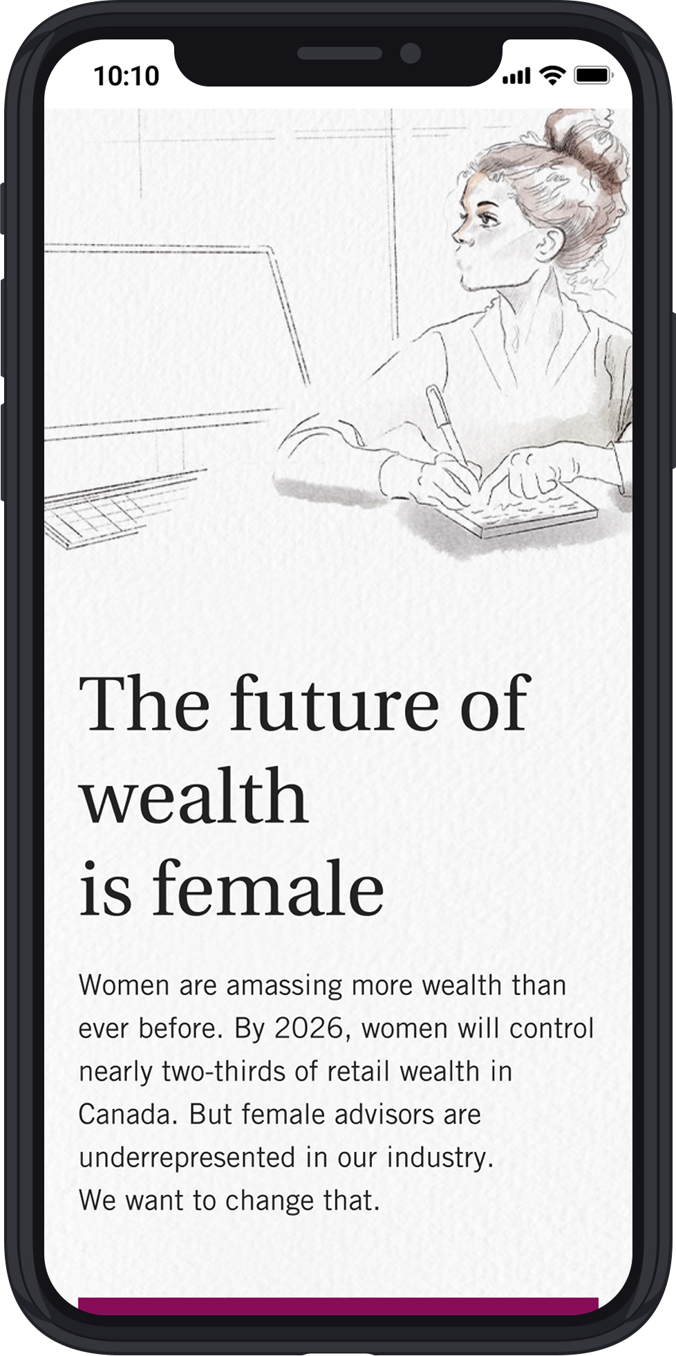
Concept 2
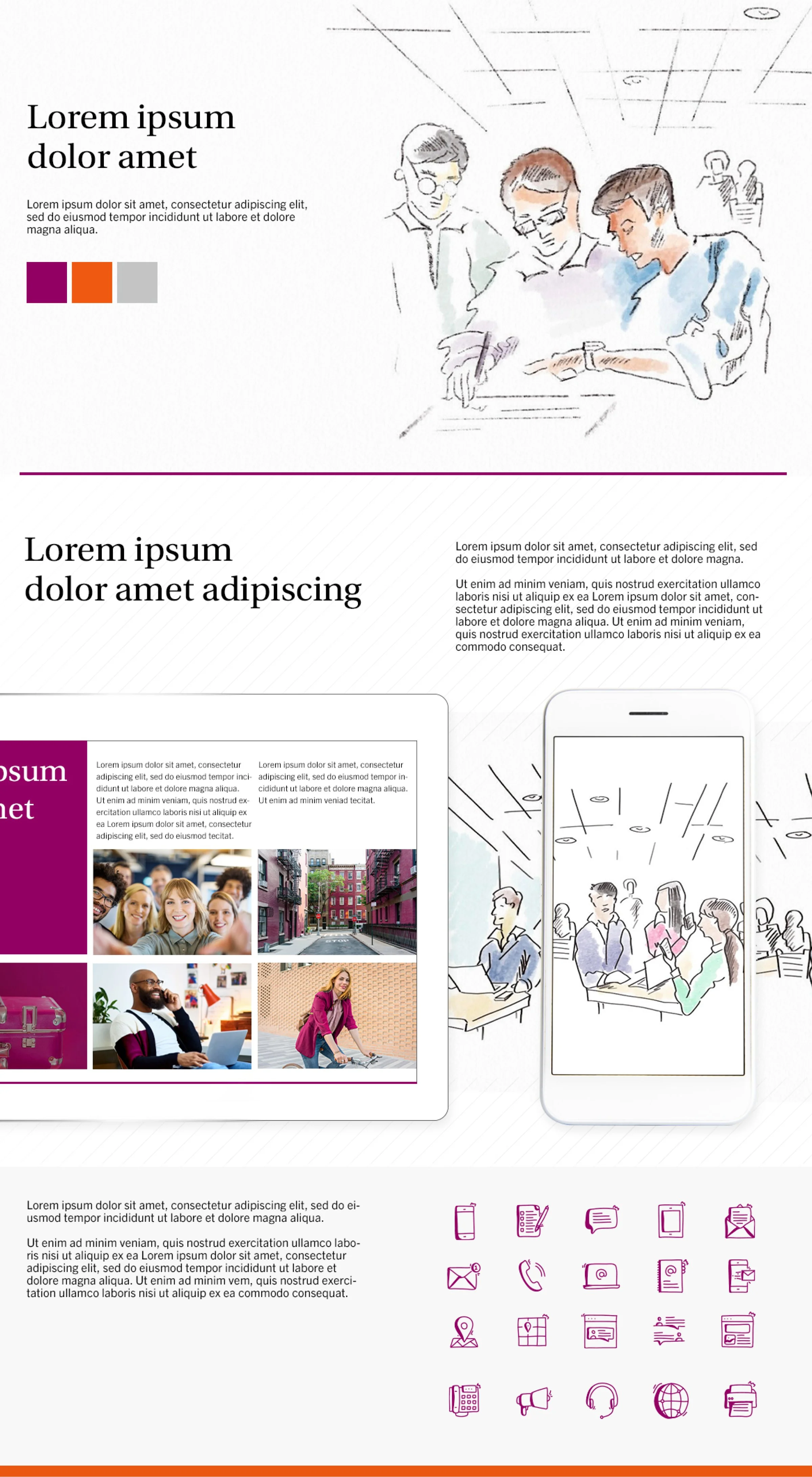
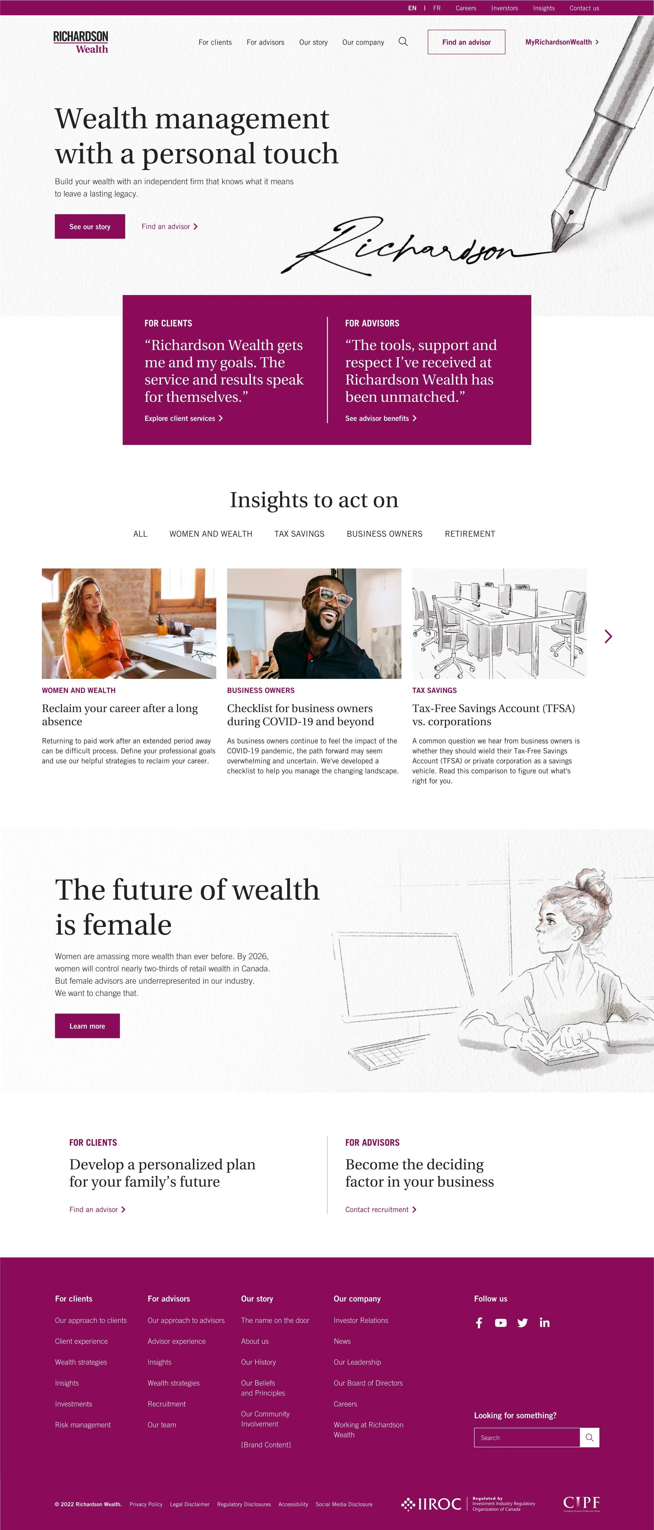
Theme: Personal Touch
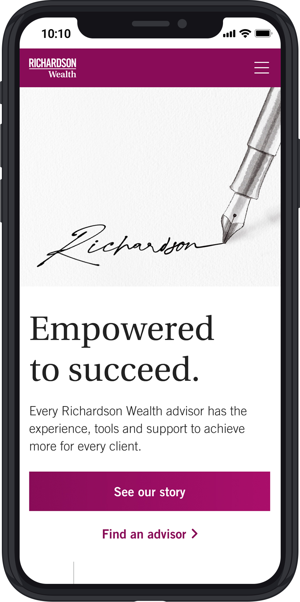
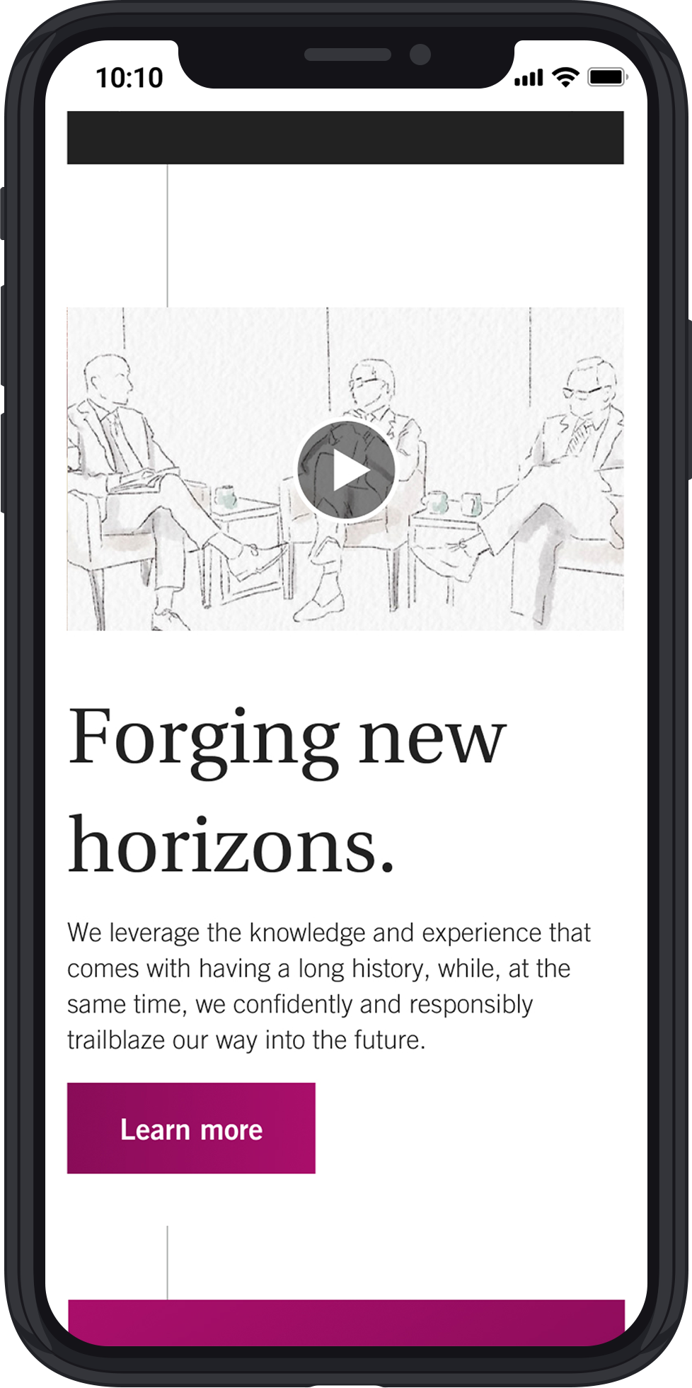
Polished, crafted, personalized - this concept embodies Richardson Wealth’s approach to wealth management and going the extra mile.
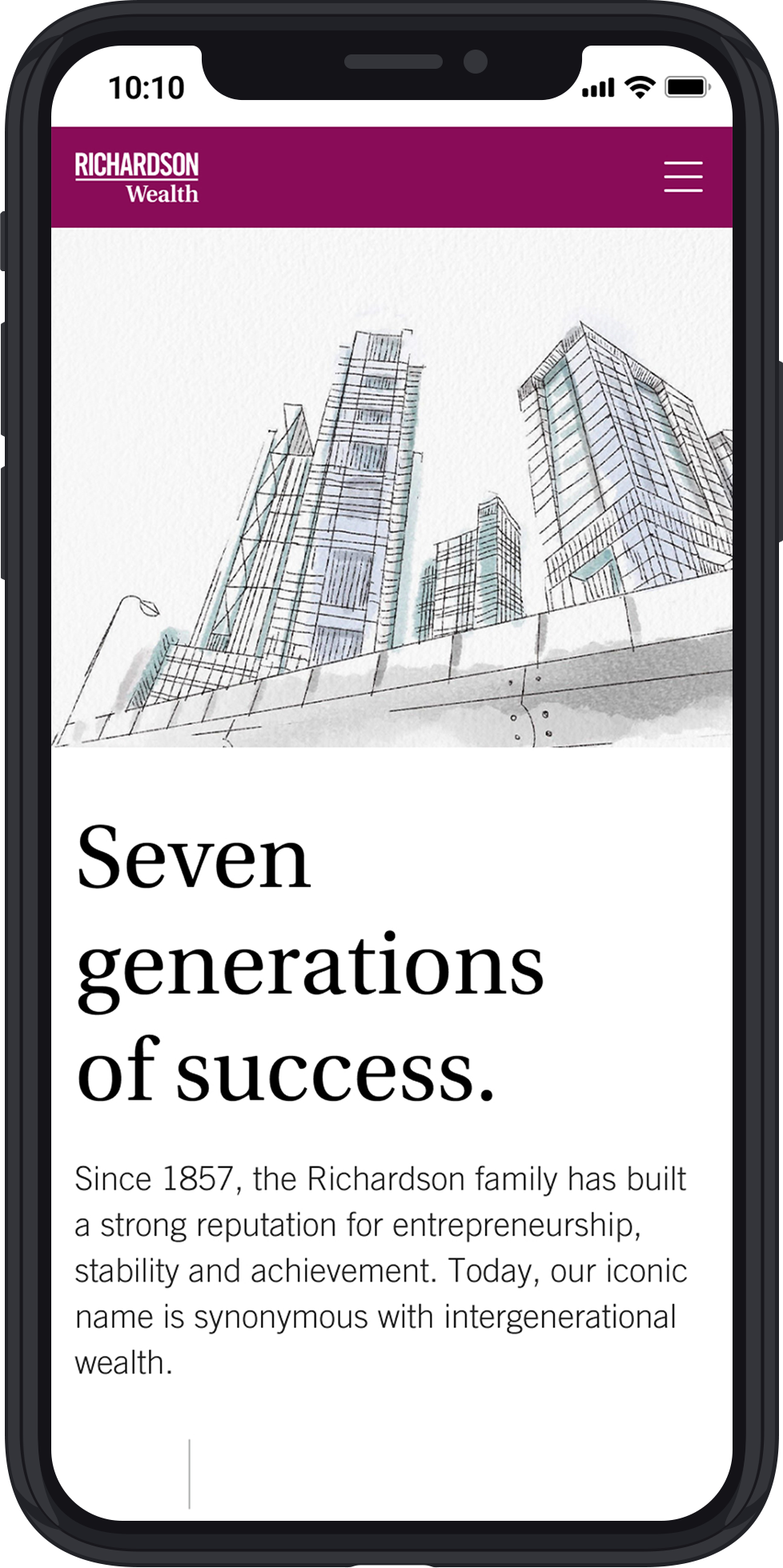
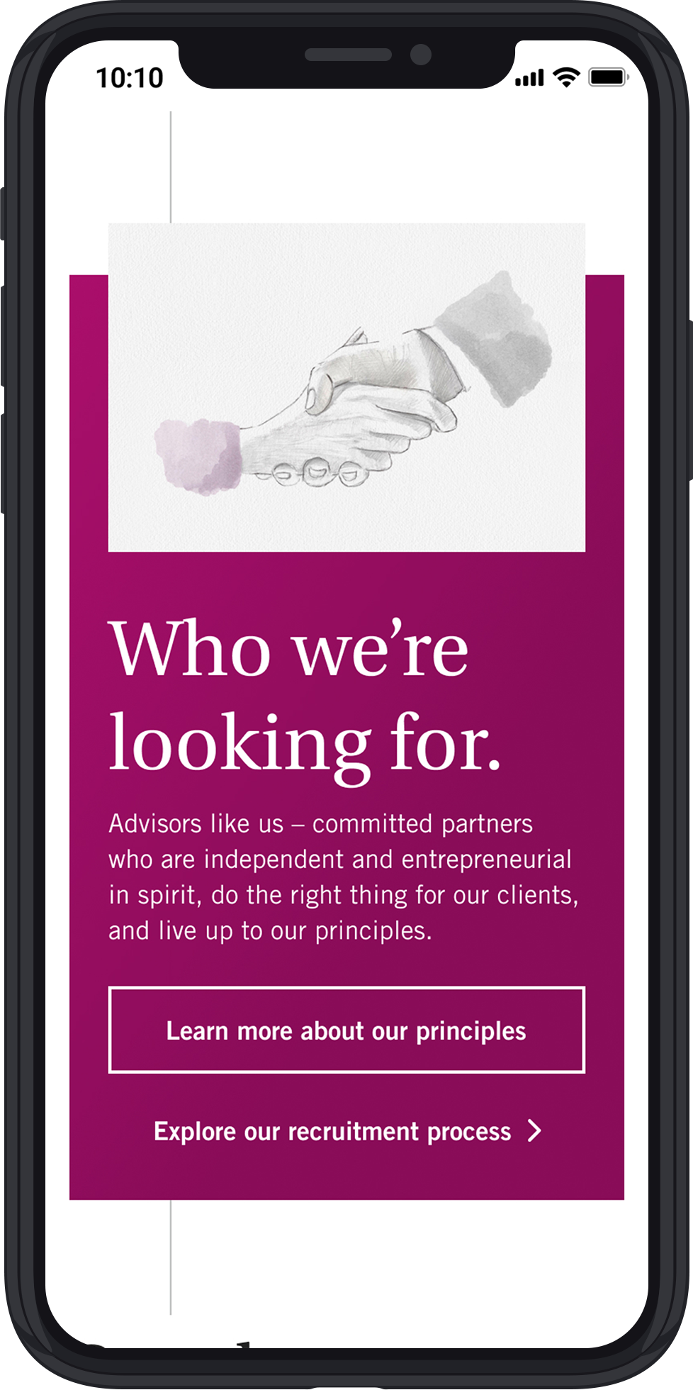
The subtle paper texture and custom watercolour illustrations add warmth and a layer of class, a point of differentiations from anyone in the category.
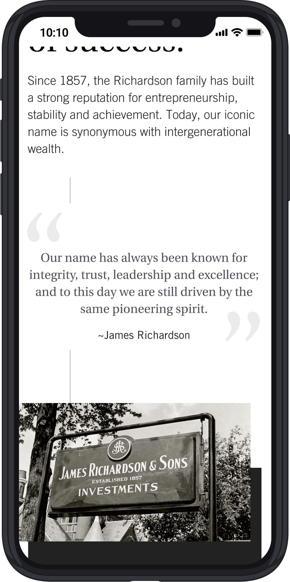
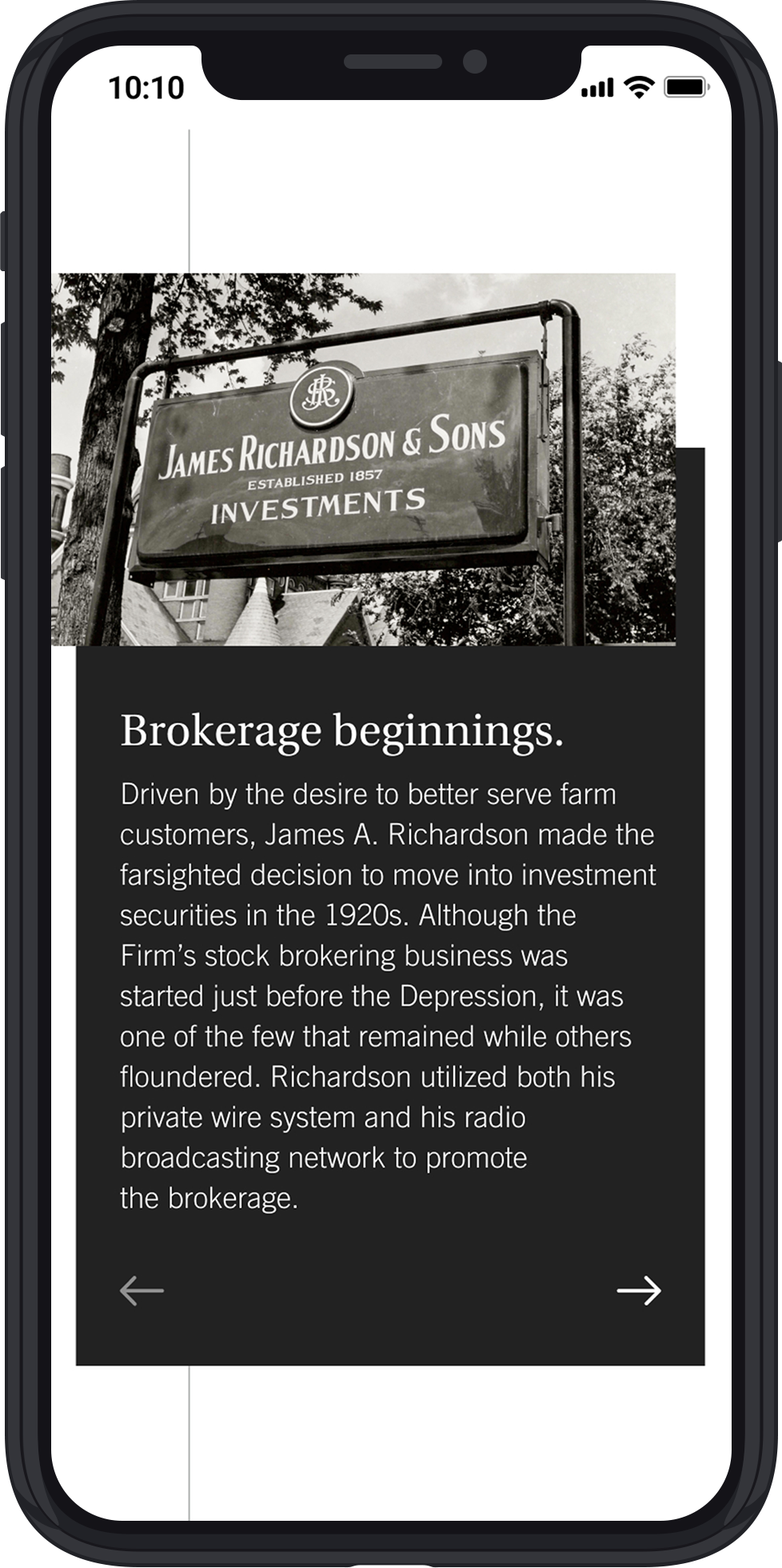
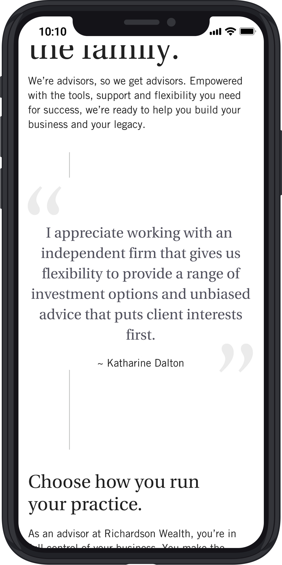
The copy builds on this theme. From the hand-written Richardson Signature, to the inclusion of personal quotes/testimonials, to the language peppered throughout, this concept highlights the strong personal relationships that are integral part of the Richardson Wealth experience whether you’re a client or an advisor.
Feedback
Clients appreciated both concepts and they wanted us to try combining them. They loved the bold language and the clean, focused layout in Concept 1, but they were also very drawn to the personalized illustrations as well as the editorial look and feel in Concept 2 which helps promote the meaning of the “personal touch” they like to offer to clients.
Client Review - Round 2
Hybrid A: Concept 1 + Illustration
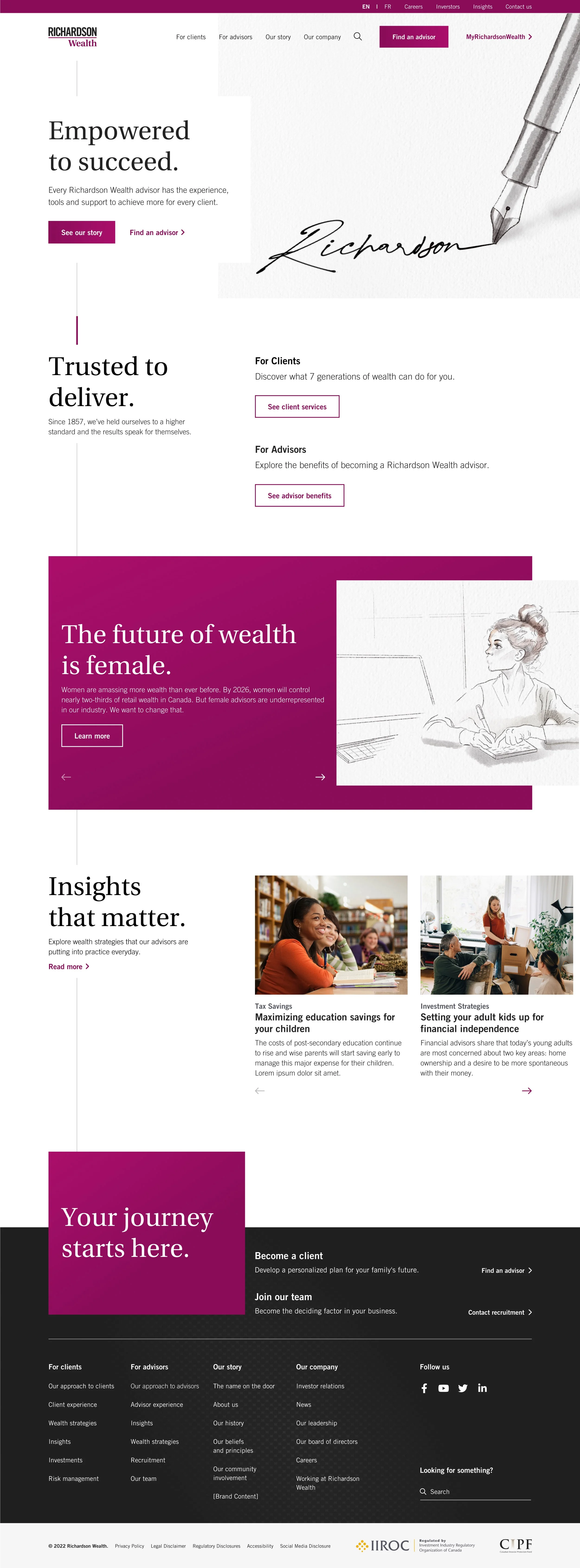
HOME

Our Story
Hybrid B: Concept 1 + Concept 2
HOME

Our Story
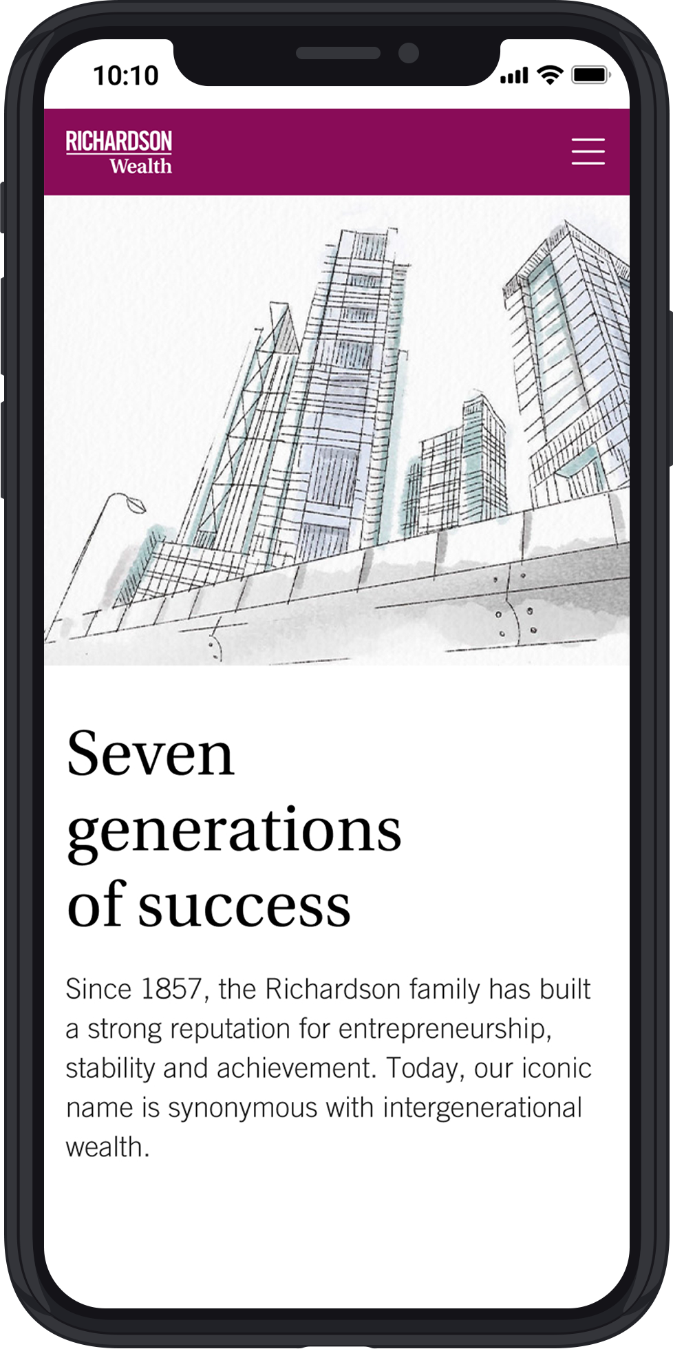

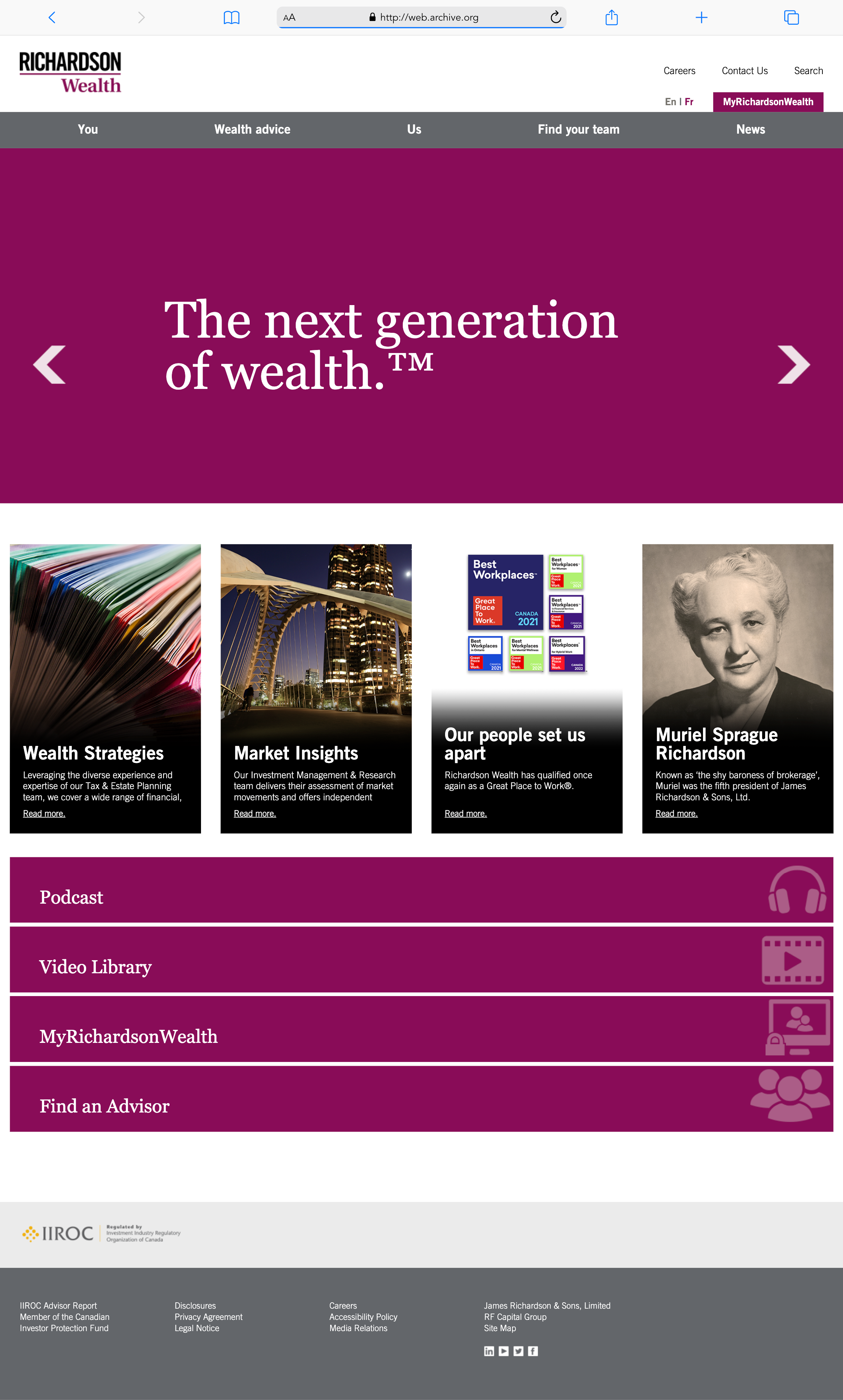
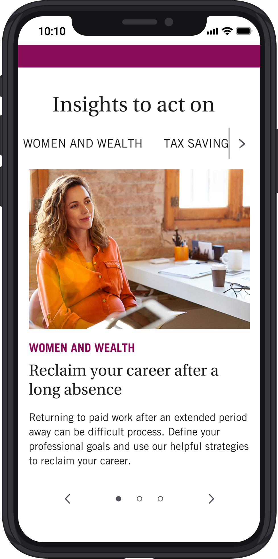
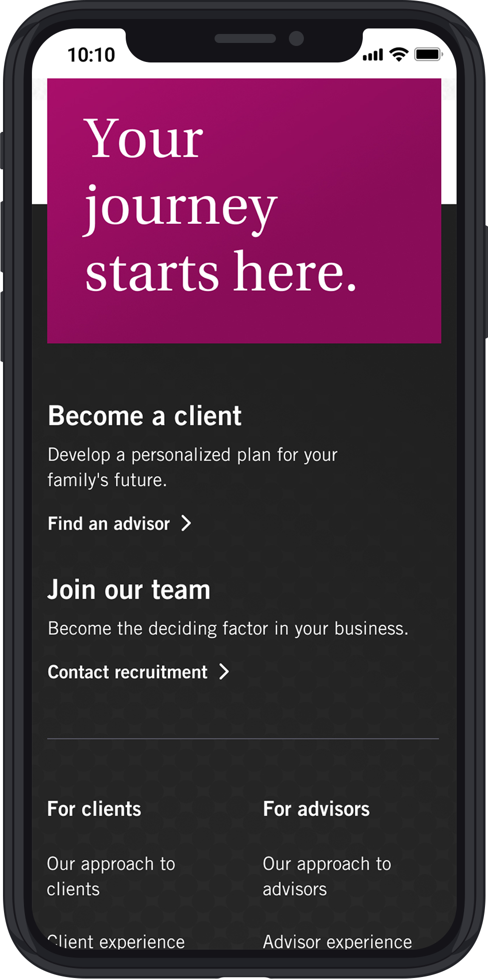
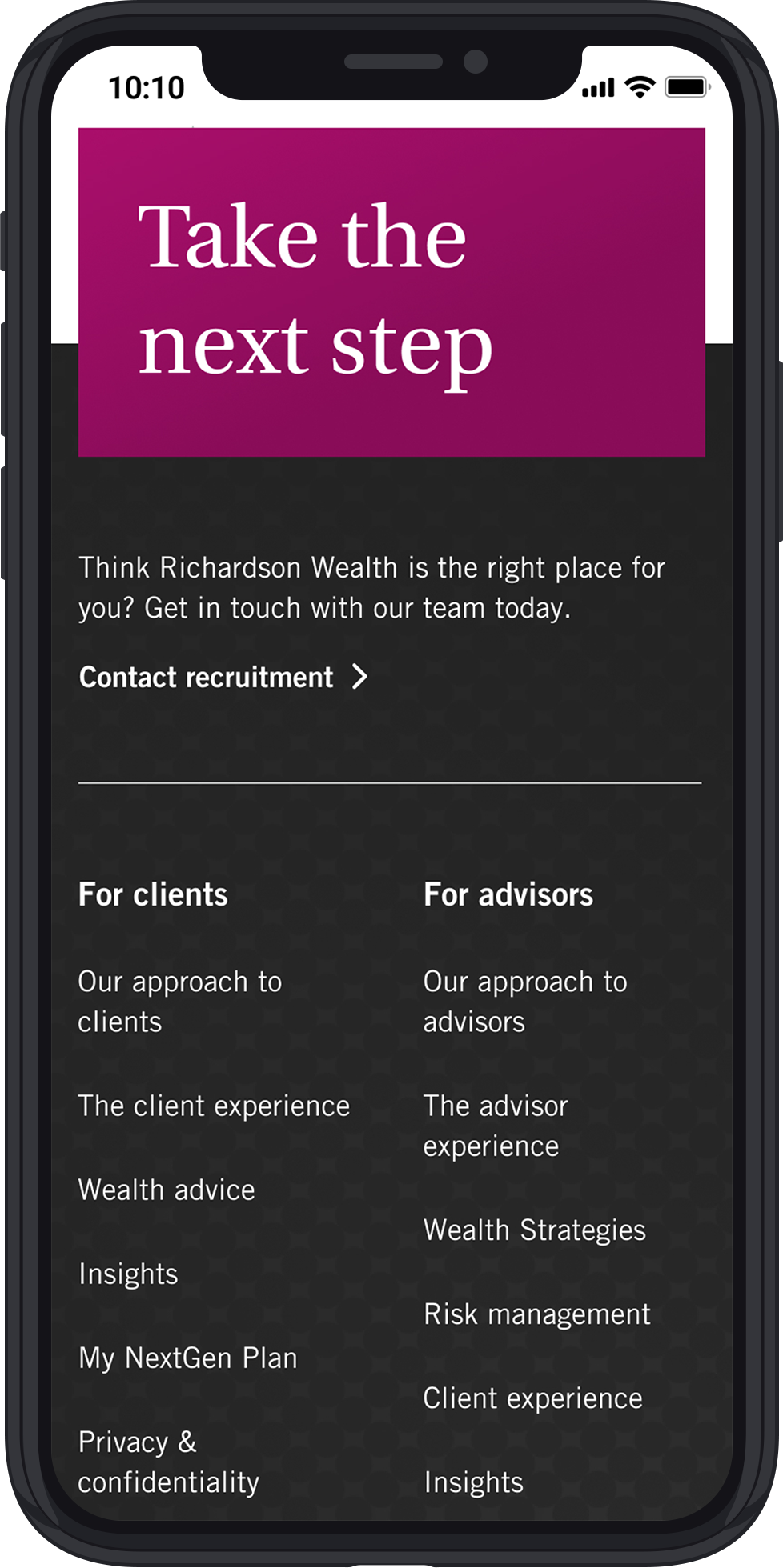
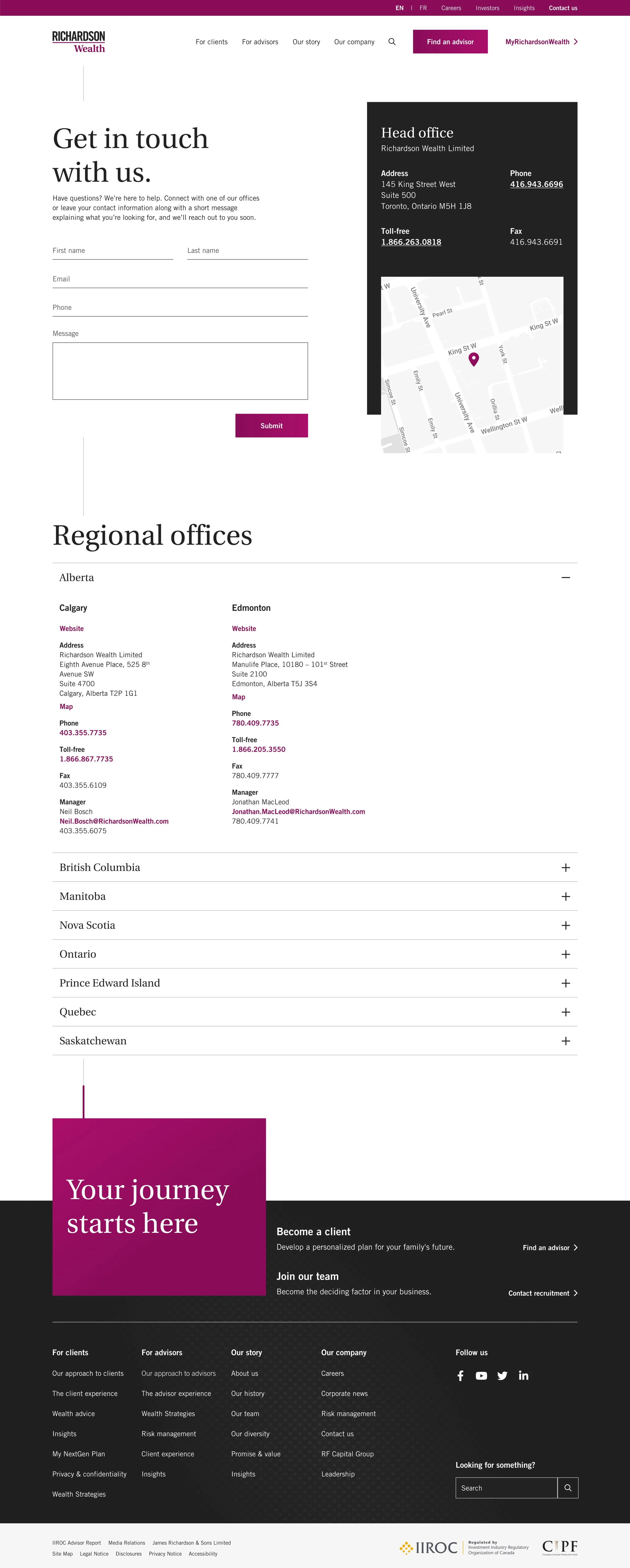
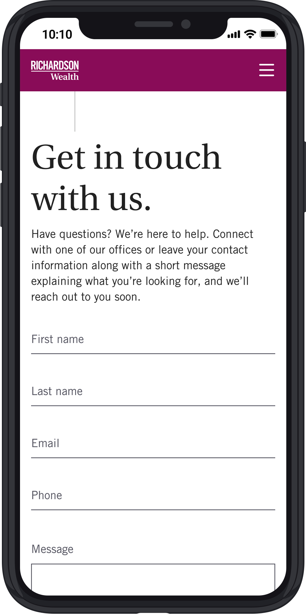
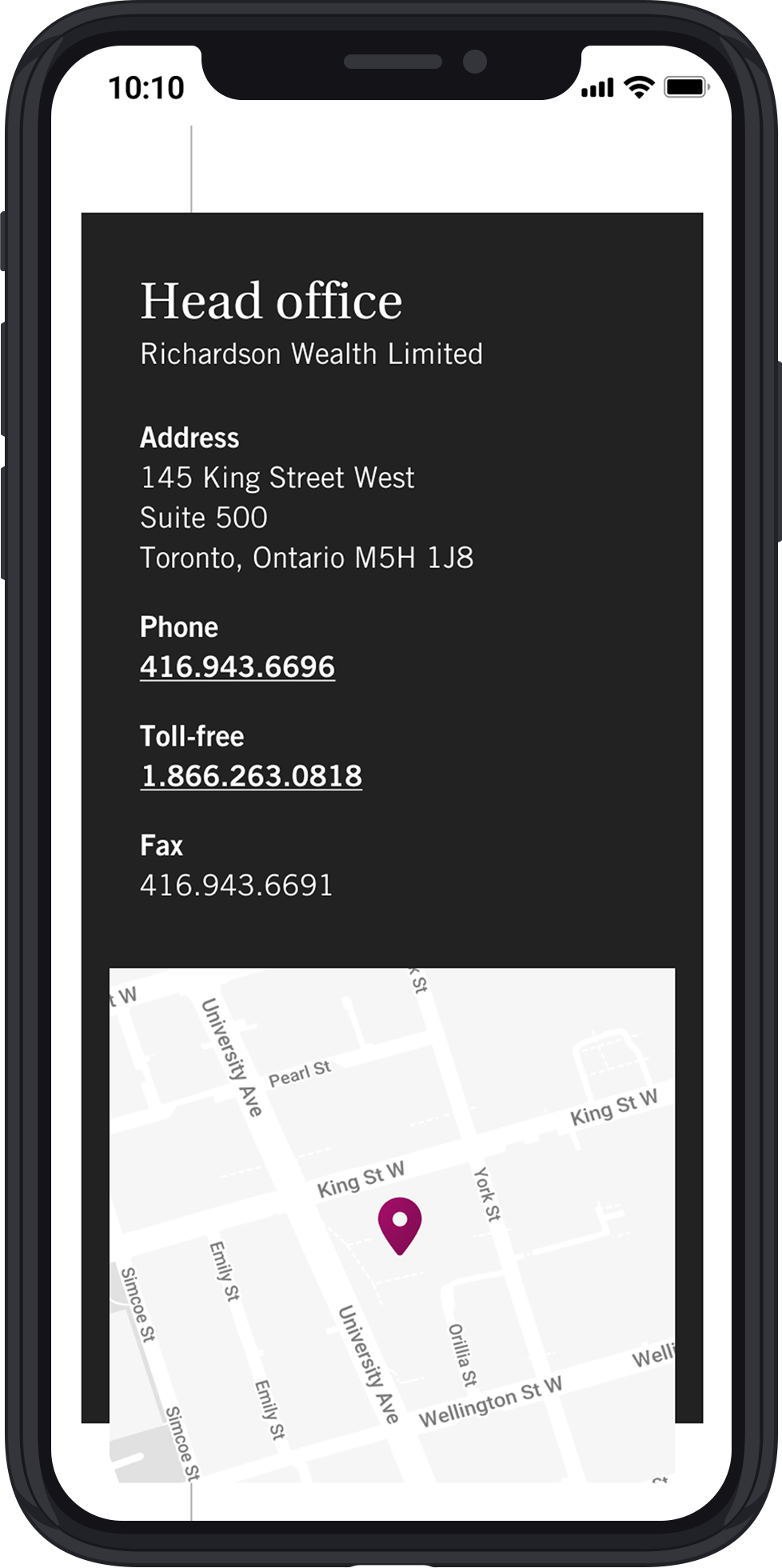
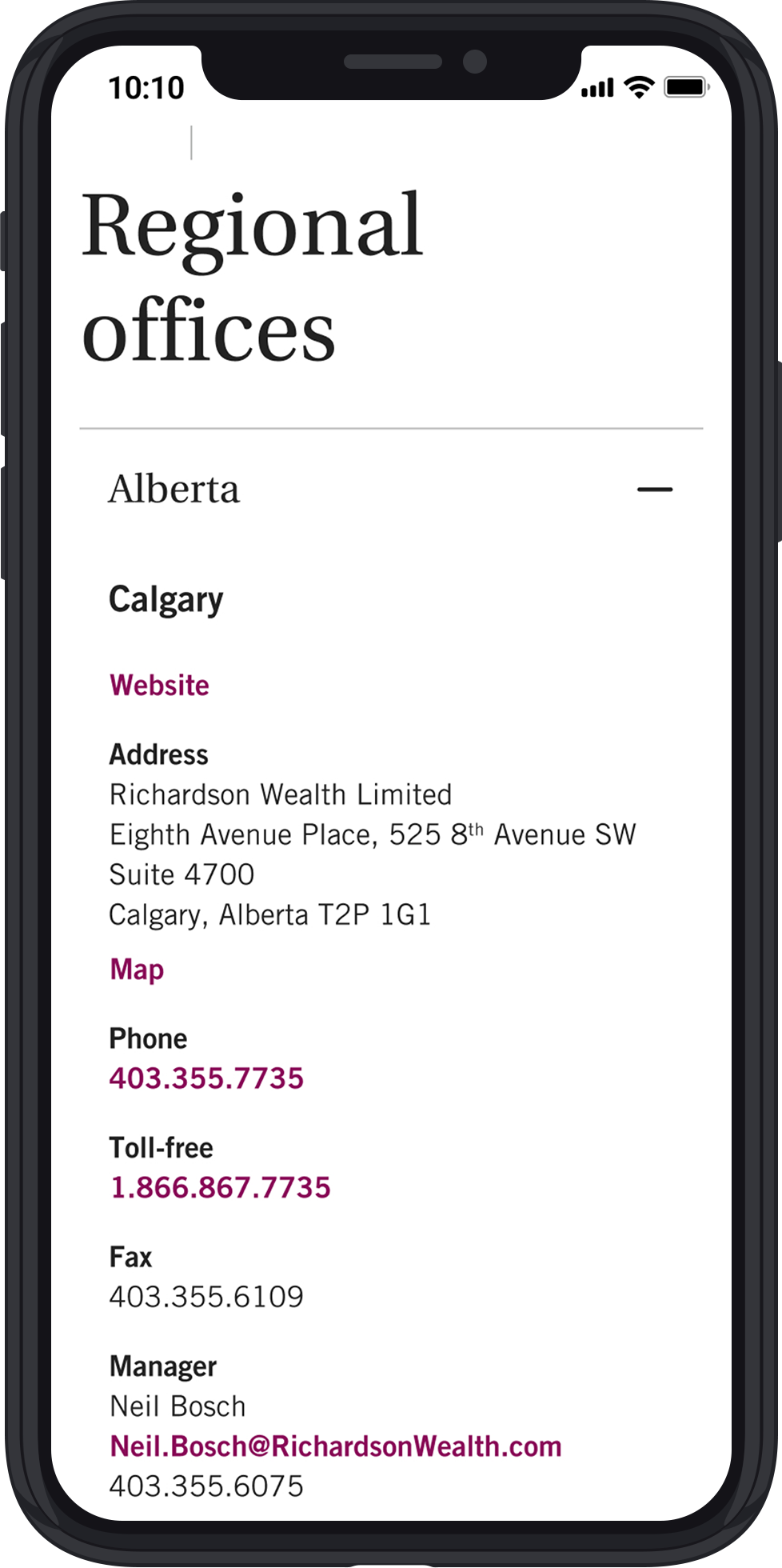
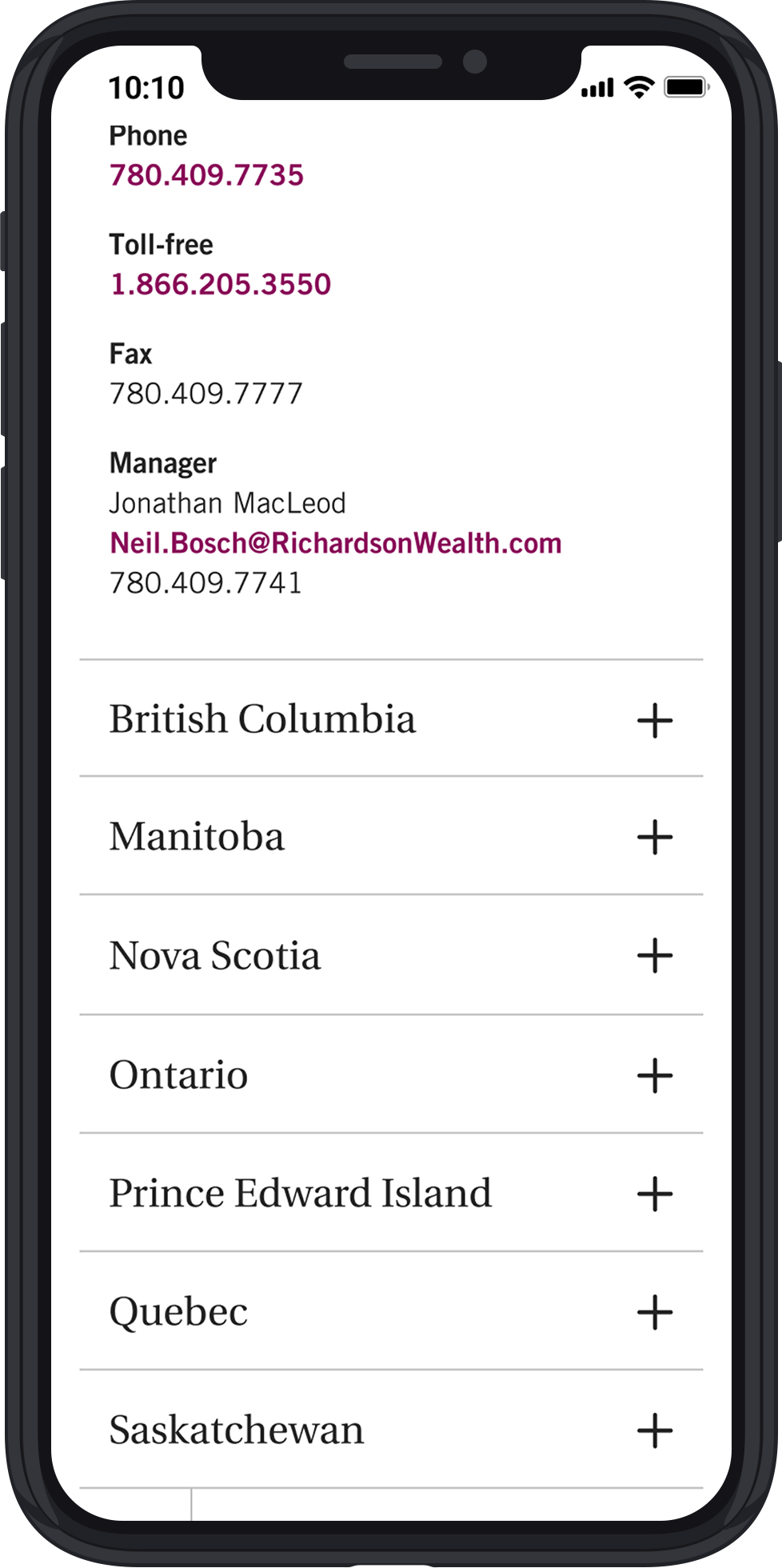
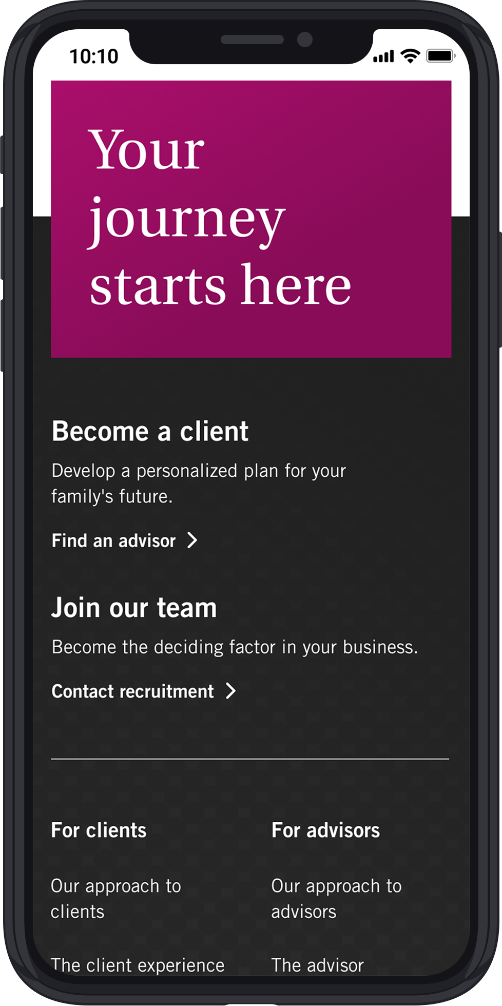
Final Pages
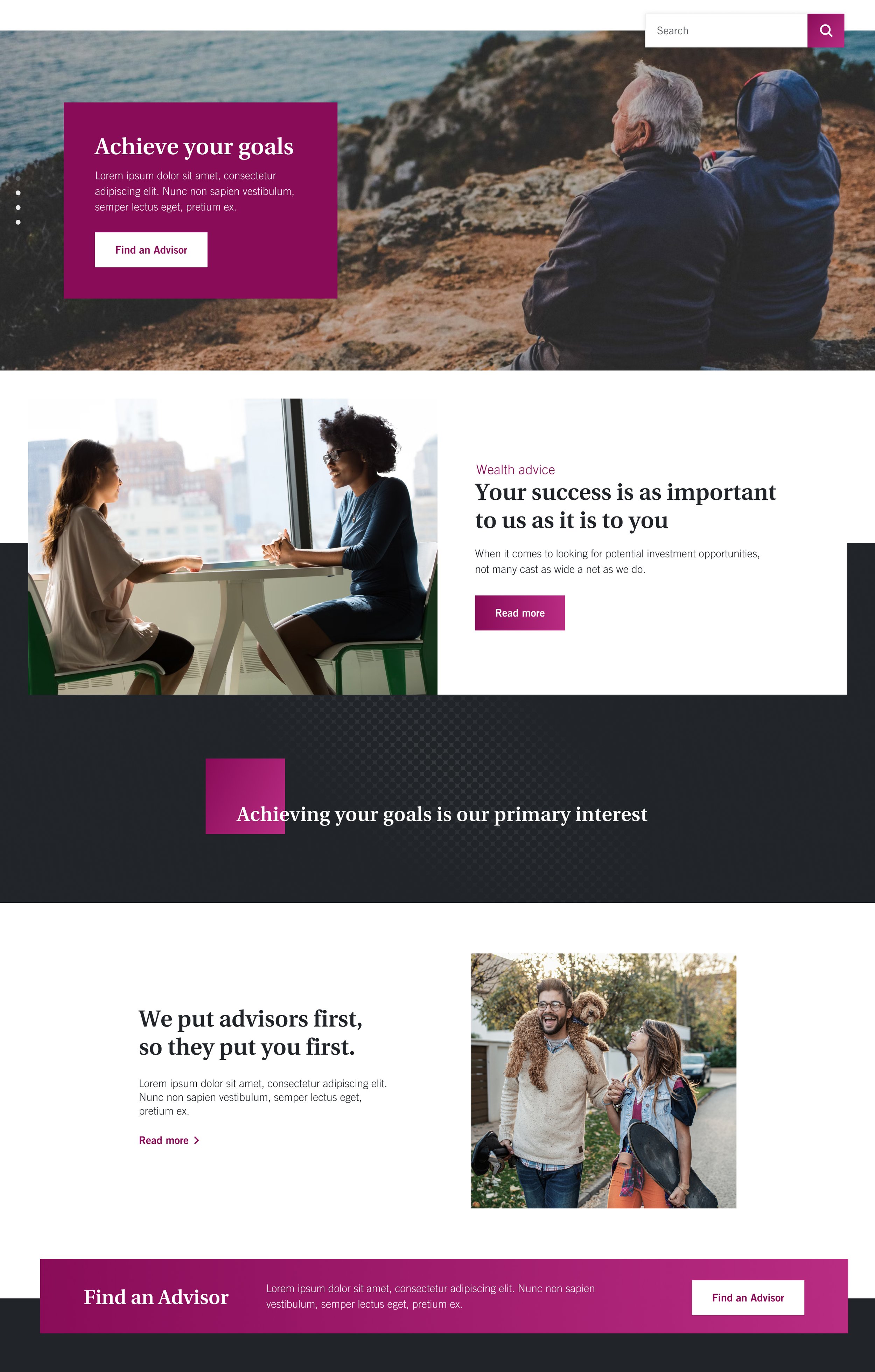
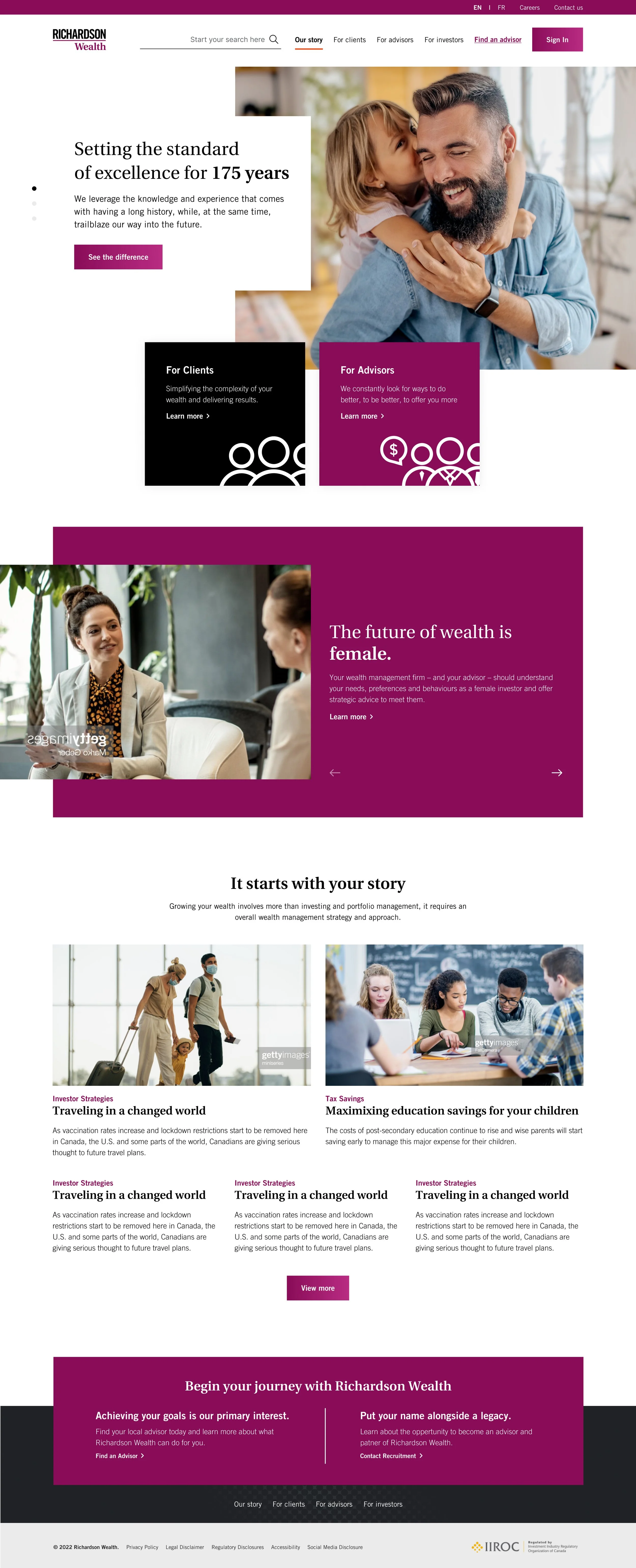
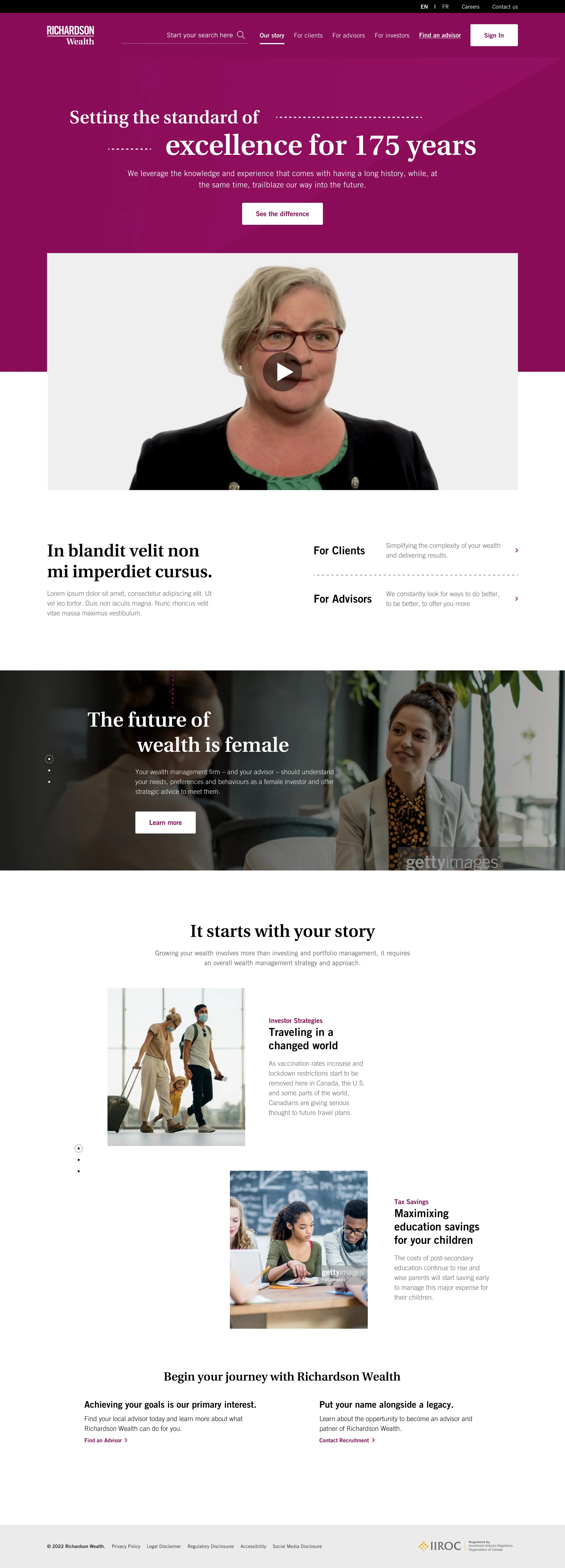
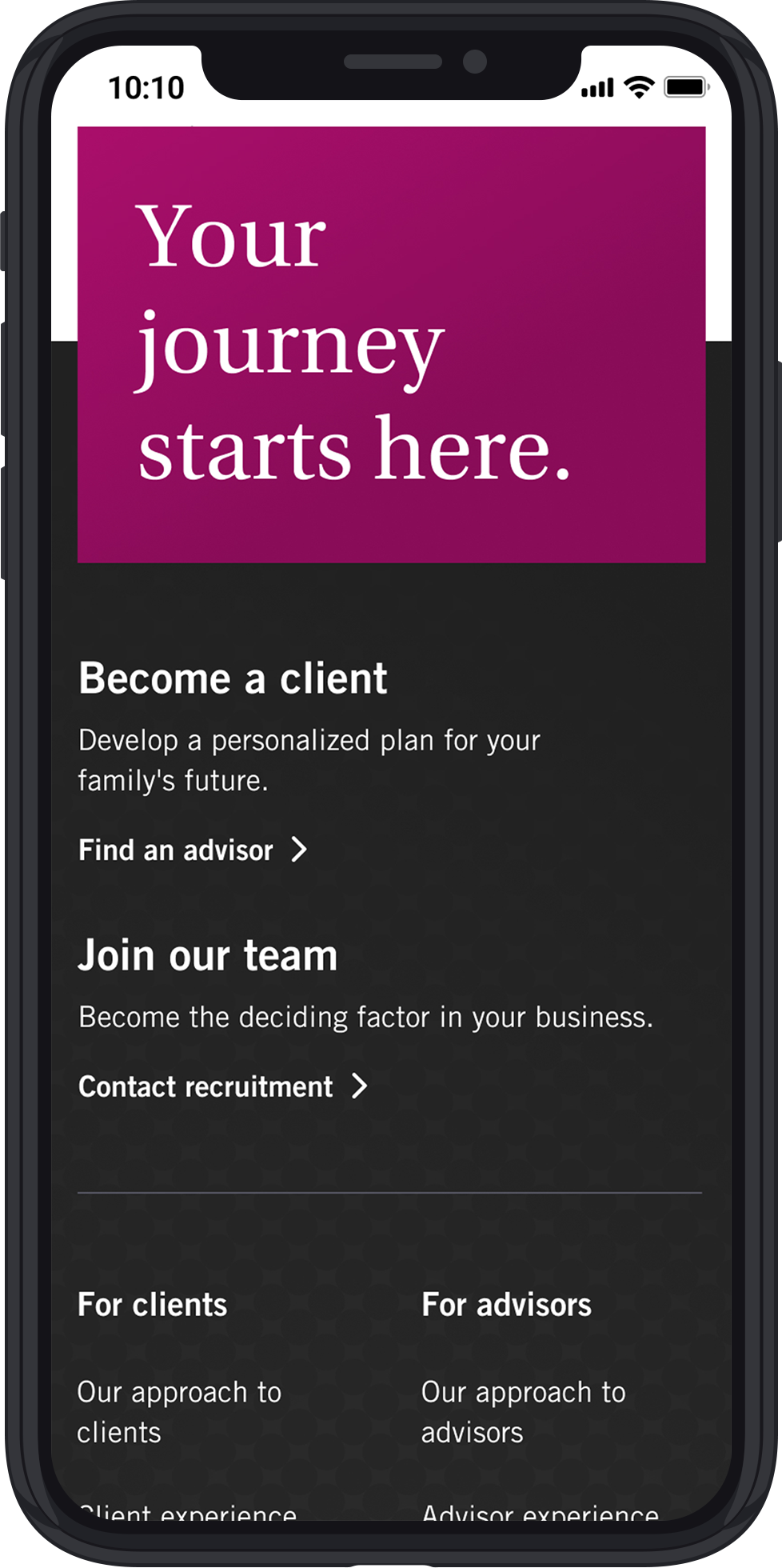
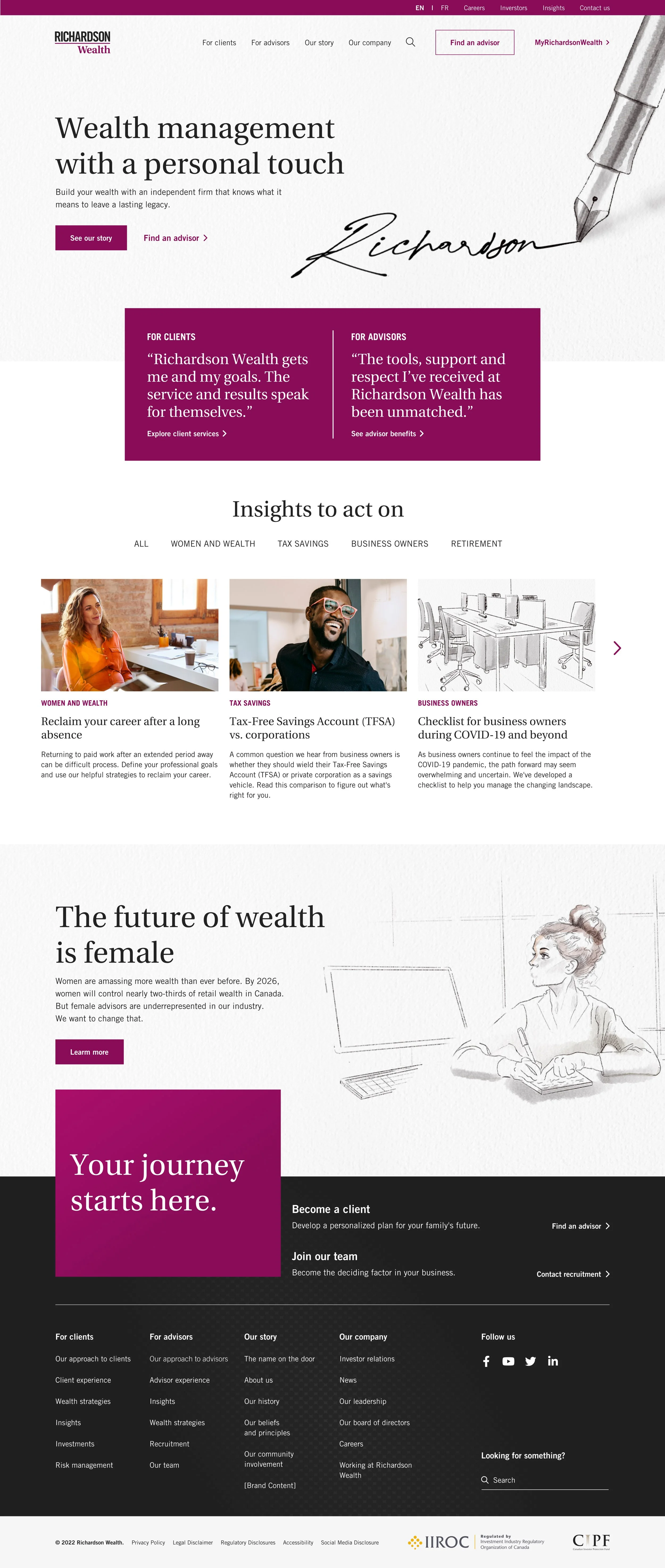
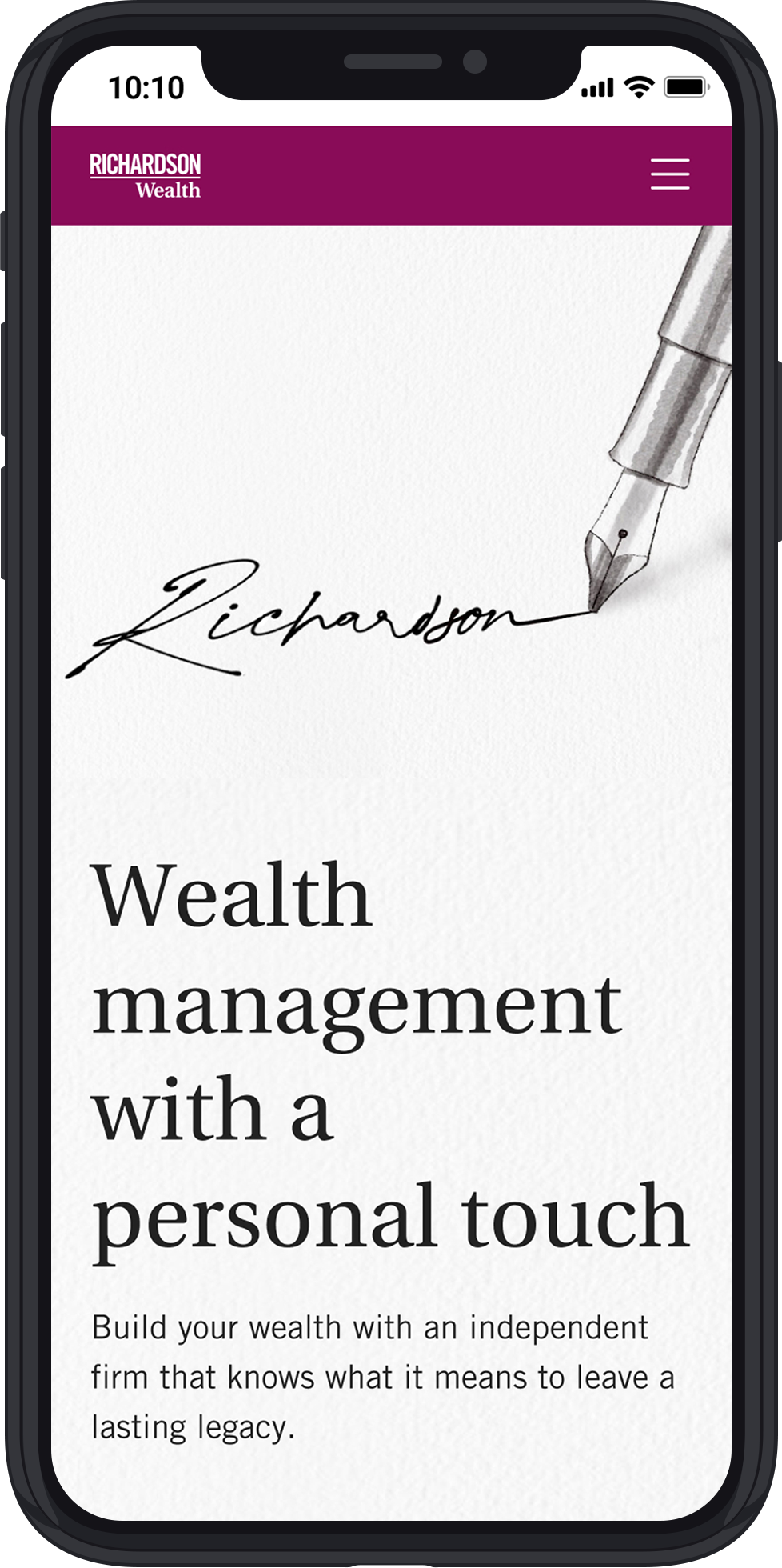
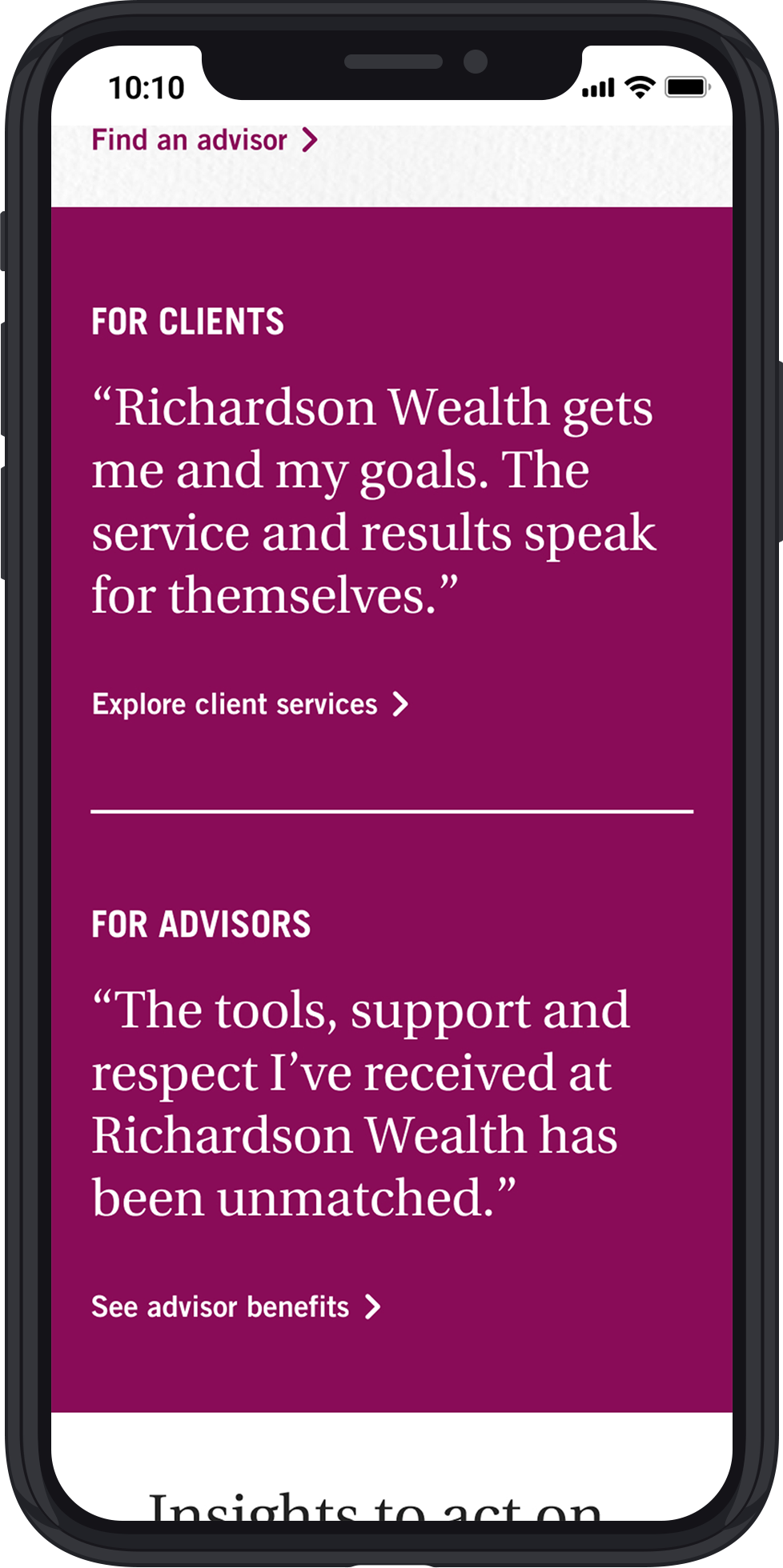
Clients decided to go with Hybrid A: Concept 1 + Illustration
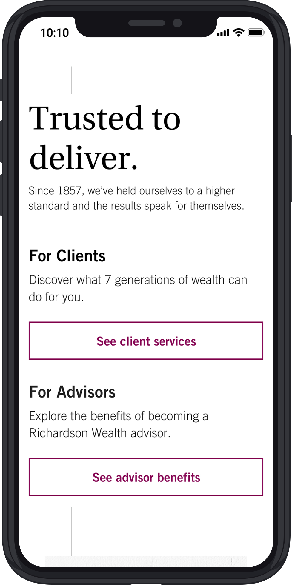
Below are some of the pages that were designed as part of the project. If you would like to explore more, please click on the button below.
For Advisors
Contact Us
Awards
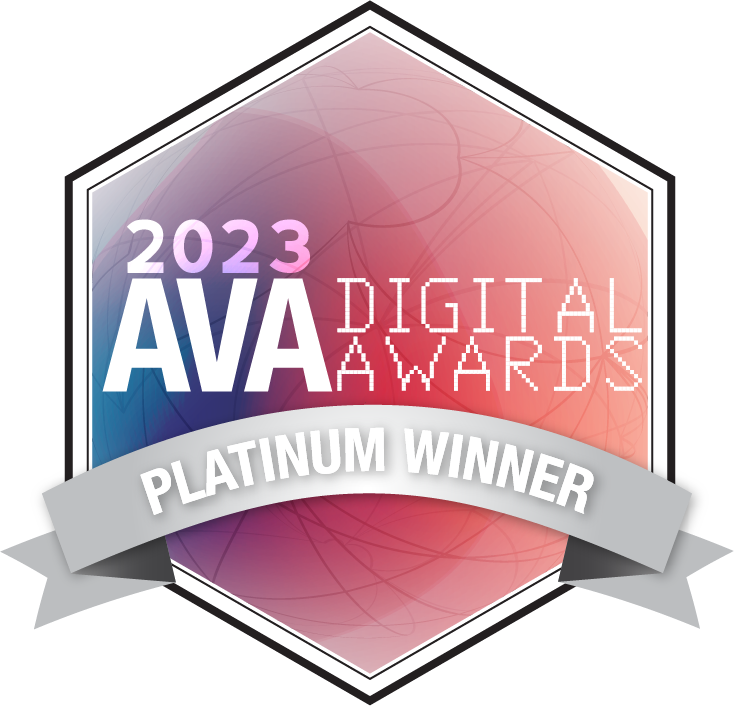
The Richardson Wealth team submitted this work to the AVA Digital Awards competition and won Platinum for all 5 award categories below:
Website
Website Redesign
Redesign
Business to Business
Financial