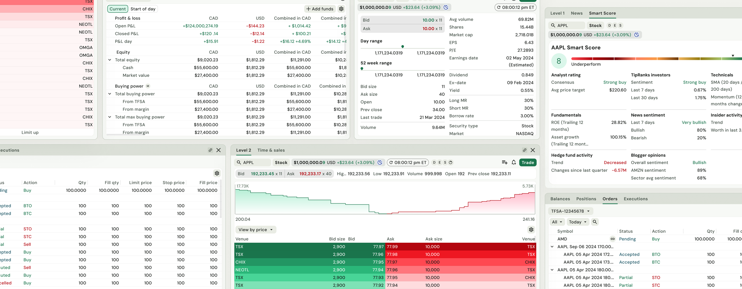
Atlas was originally designed to support Questrade Pro's dark theme, with semantic tokens tailored specifically to that experience. When the business decided to introduce a light theme, what initially appeared to be a visual redesign became an opportunity to strengthen the design system's foundation.
Rather than creating a separate set of colours for light mode, my design partner and I saw the opportunity to redesign the semantic token architecture so Atlas could scale to multiple themes while becoming easier for designers to understand and simpler for engineers to implement.
Atlas: Semantic token architecture
Role
Product designer - Design systems
Platform
Web
My role
I partnered with another product designer to lead the redesign of Atlas's semantic colour token architecture. Working closely with Questrade's Brand Design System team and engineering, we designed a scalable semantic foundation, aligned our system with the broader design language, and delivered the new architecture to engineering for implementation, all within a 4-week timeline.
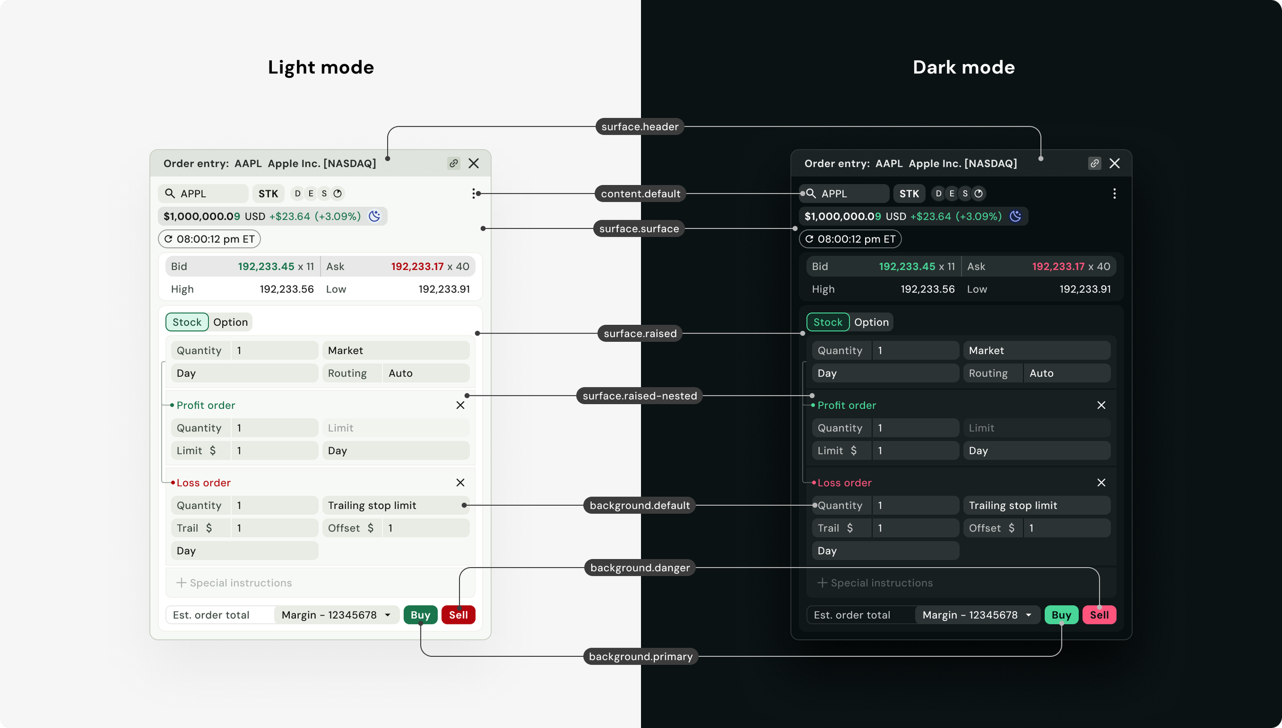
Raw defines the underlying colour values
Primitive provides reusable colour in the design palette
Semantic maps those colours to their intended purpose within the interface
Components consume semantic tokens rather than referencing colours directly, allowing the system to adapt as themes evolve.
Updated Semantic Token Architecture
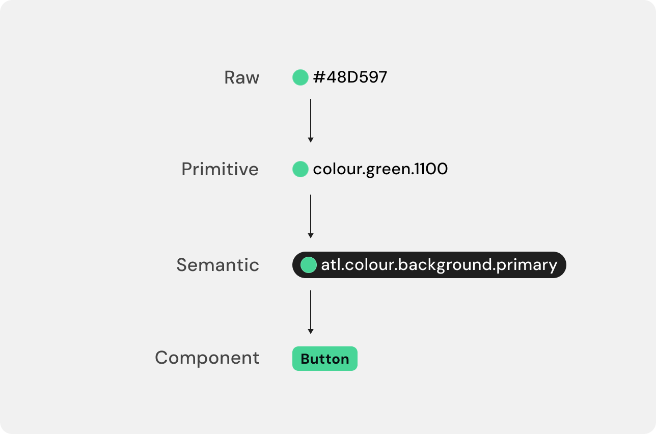
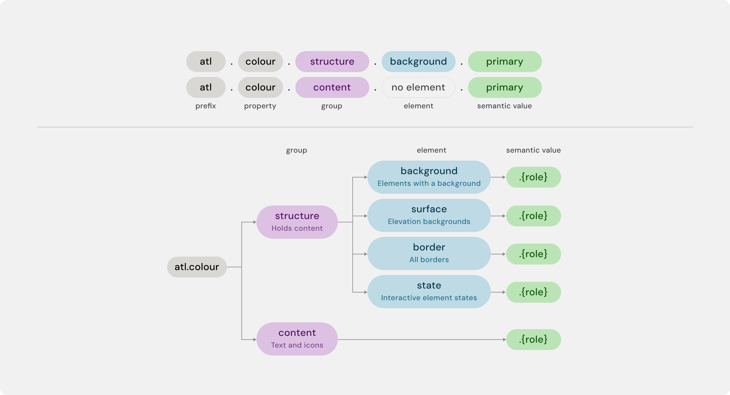
Below is the updated semantic token architecture.
The Challenge
The biggest challenge wasn't designing a light theme, it was that the project had originally been scoped as a 2.5-week visual update. My design partner and I recognized that simply updating colours would introduce technical and design debt because the existing token architecture wasn't built to support multiple themes. We worked with product leadership to expand the scope to include a semantic token redesign, extending the timeline to 4 weeks and creating a scalable foundation for Atlas.
Objectives
Our redesign focused on creating a semantic token architecture that would support the long-term growth of Atlas while improving the experience for both designers and engineers.
Our objectives were to:
Build a scalable, reusable semantic token architecture that is able to support multiple themes
Create intuitive, semantic token names that reduce the cognitive effort required to understand when and how tokens should be used
Improve consistency by ensuring UI elements serving similar purposes shared the same semantic tokens
Minimize disruption for engineering by creating a structure that could be implemented and maintained efficiently.
Before the update
This image shows how our old semantic tokens were mapped in the platform.
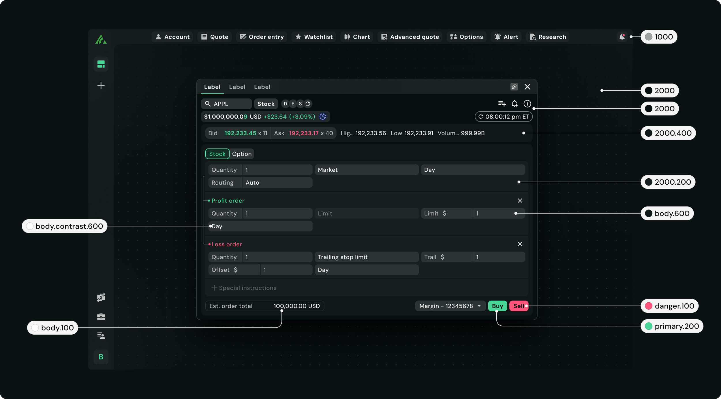
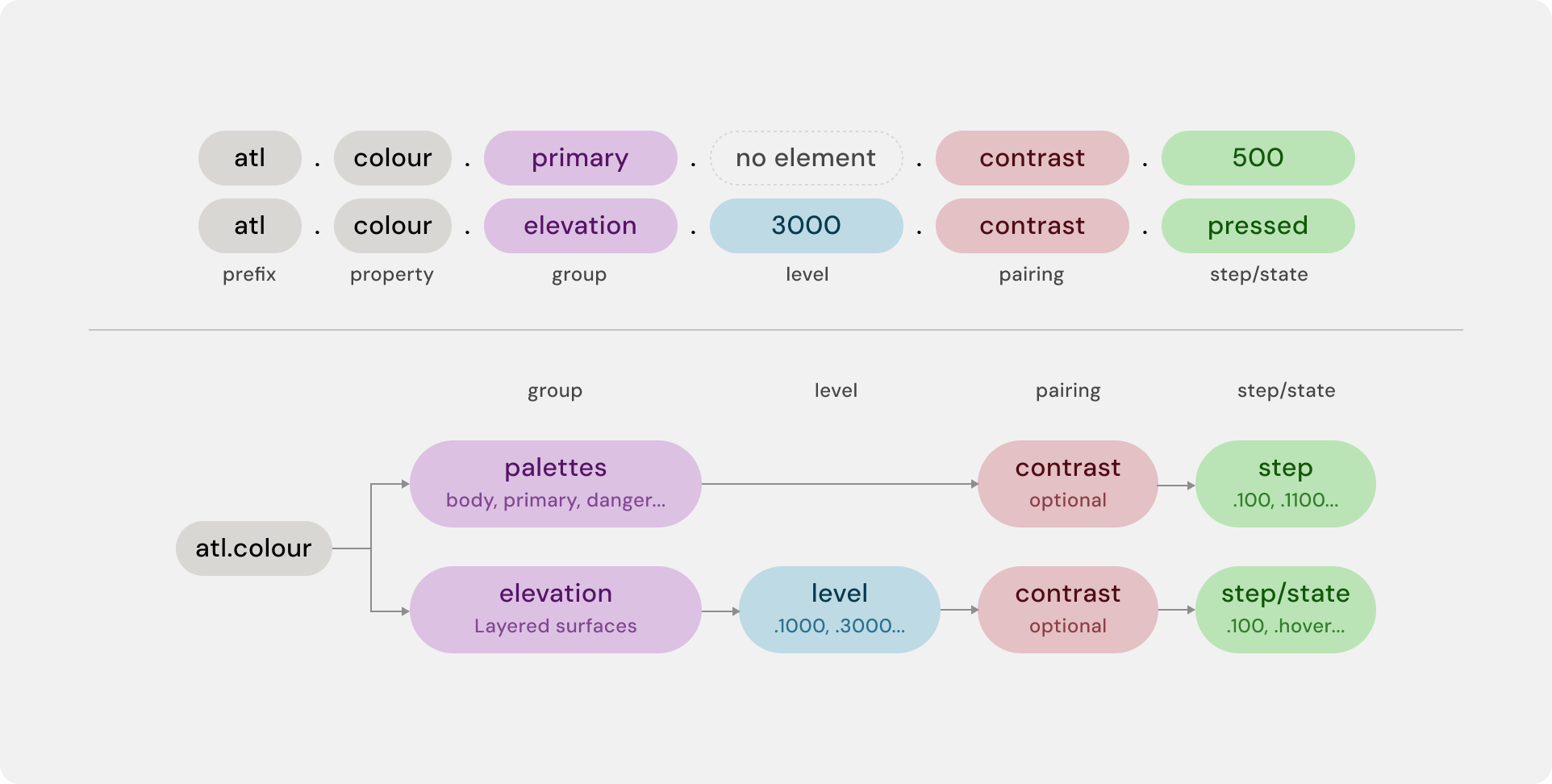
This is our old semantic token architecture.
Process
Designing the light theme itself was relatively straightforward because Questrade's Brand Design System had already established the overall visual direction. We adapted Atlas using those foundations while following the same design principles we had previously established for dark theme.
The most complex design challenge was preserving our elevation model.
In dark theme, surfaces become lighter as they move closer to the user. This creates clear visual separation because lighter surfaces naturally stand out against darker backgrounds.
1. Solving Surface Elevation for Light Theme
Popover sits on the highest elevation in the platform.
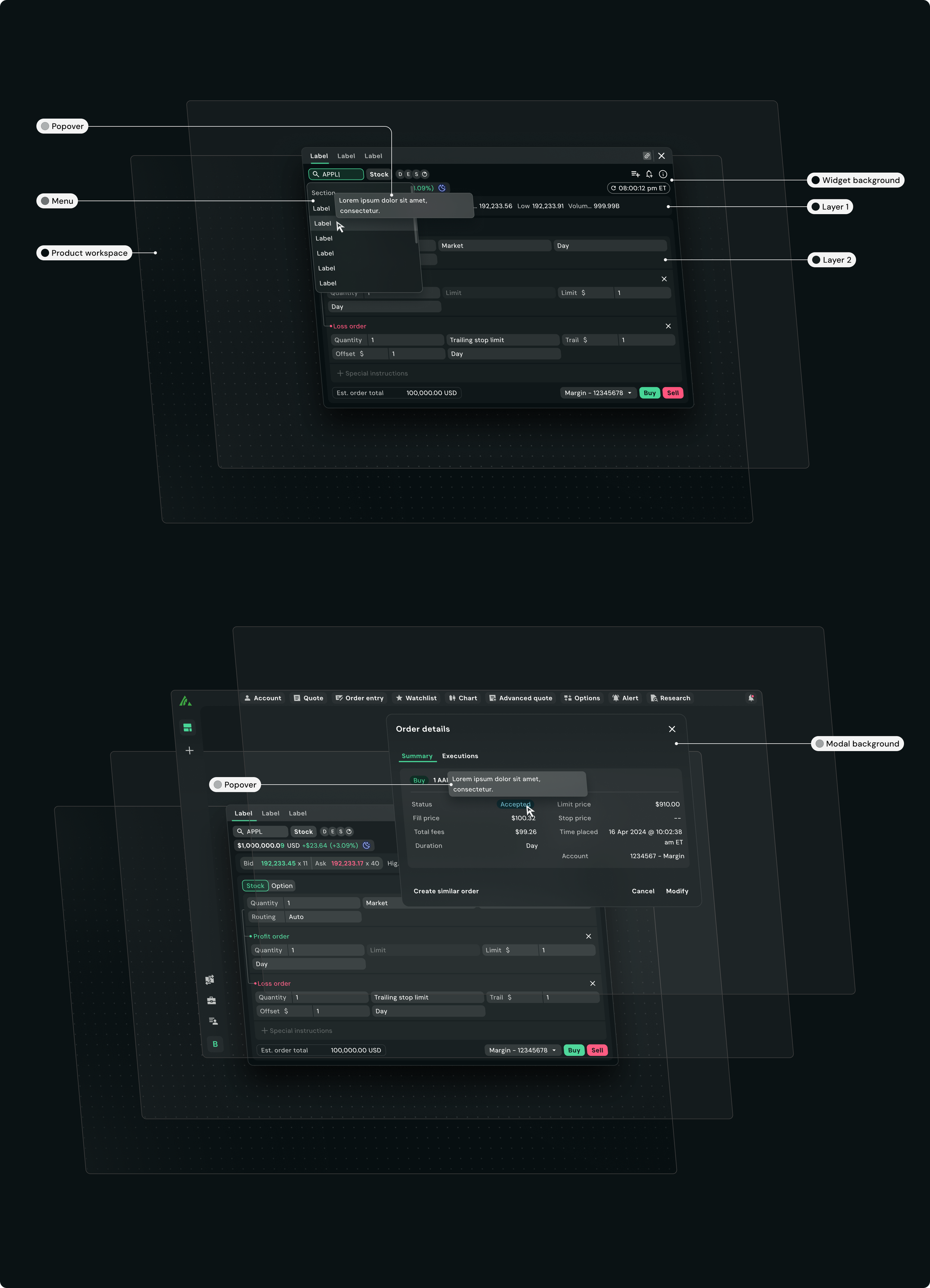
Our elevation model translated well to most of the light theme, but accessibility exposed an important edge case:
Green and red semantic colours didn't meet contrast requirements against lower elevation surfaces.
Lightening those surfaces improved accessibility but reduced the visual separation needed to communicate depth.
Testing across monitors with different brightness and contrast settings confirmed that colour alone wasn't enough to communicate hierarchy.
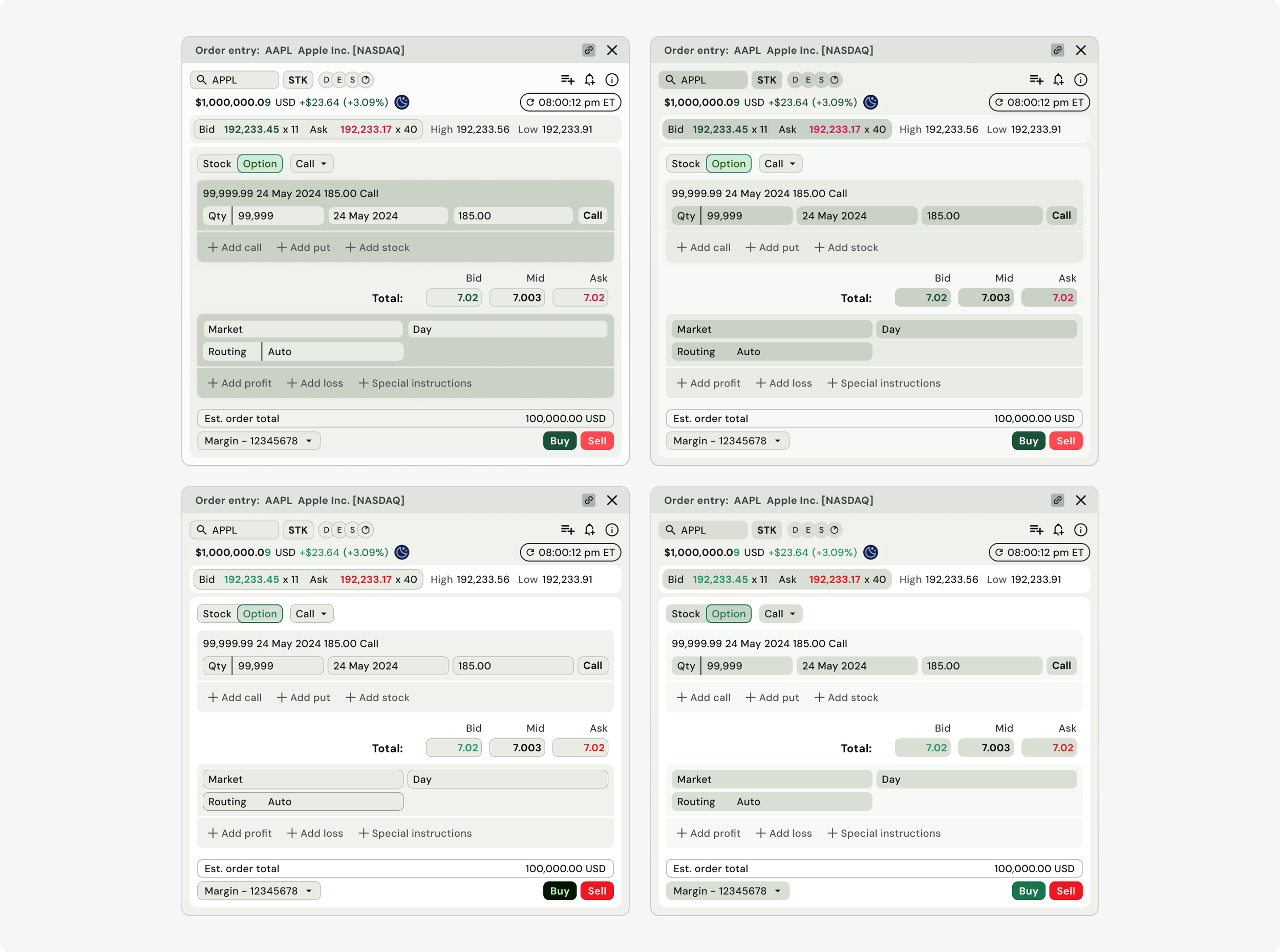
This led us to explore additional solutions with the Brand Design System team, such as:
Drop shadows to create separation
Introducing borders between surfaces
Alternating layer colours to reinforce depth
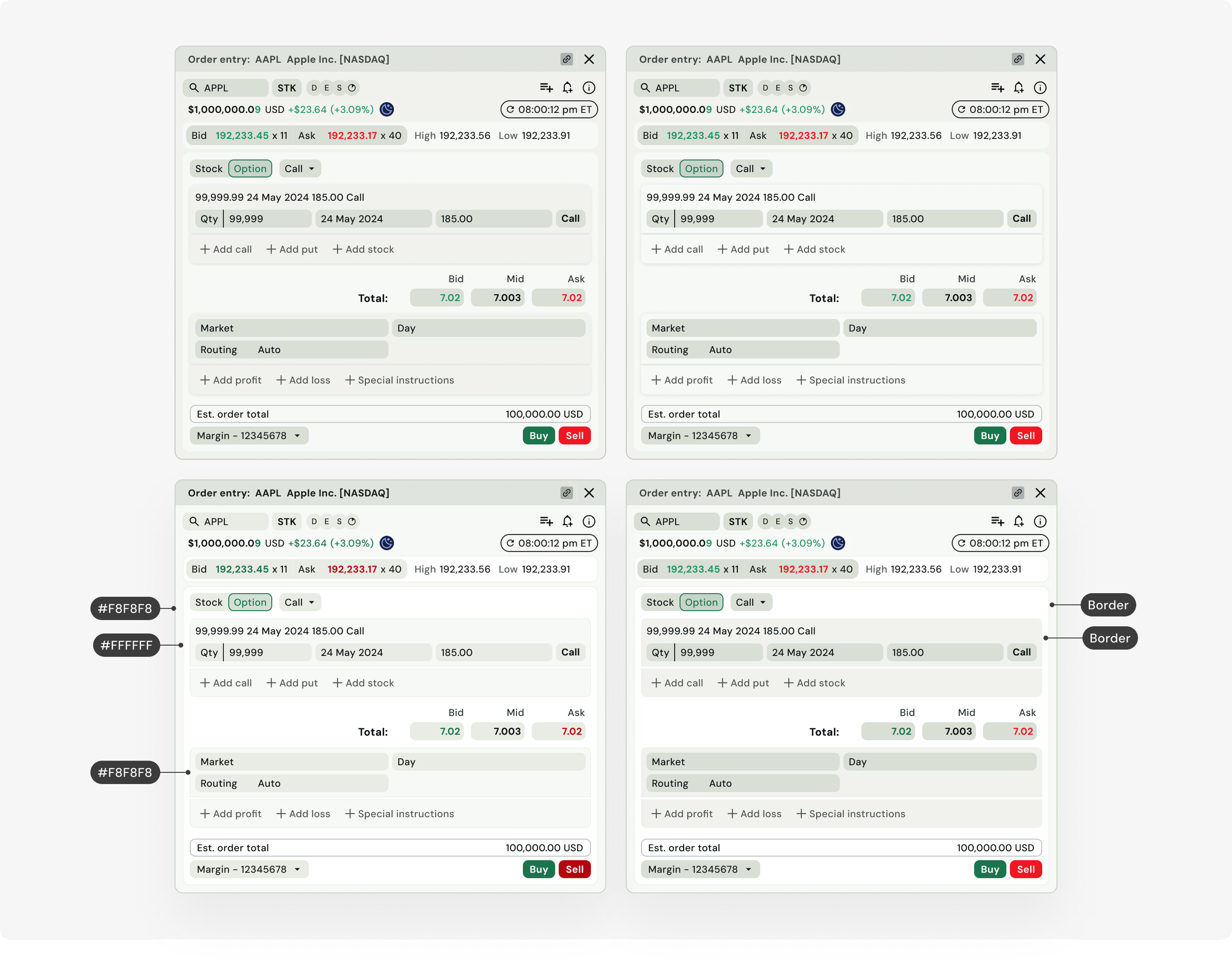
While shadows improved depth, they weren't sufficient on their own. Borders ultimately provided the subtle separation we were looking for without significantly affecting the dark theme.
Before finalizing the solution, we reviewed the implementation with engineering to understand the effort required across both themes. Because the change required minimal engineering effort, we were able to confidently adopt the updated elevation model and move forward.
Before introducing new tokens, we audited the existing architecture to understand what would prevent Atlas from scaling beyond a single theme.
2. Redesigning the Semantic Token Architecture
Tokens were named using numerical values (examples: primary-100, primary-200, primary-300) rather than their intended purpose
Designers had to memorize token usage, increasing the cognitive effort required to make design decisions.
The architecture wasn't designed to support multiple themes, making it difficult to scale and maintain over time.
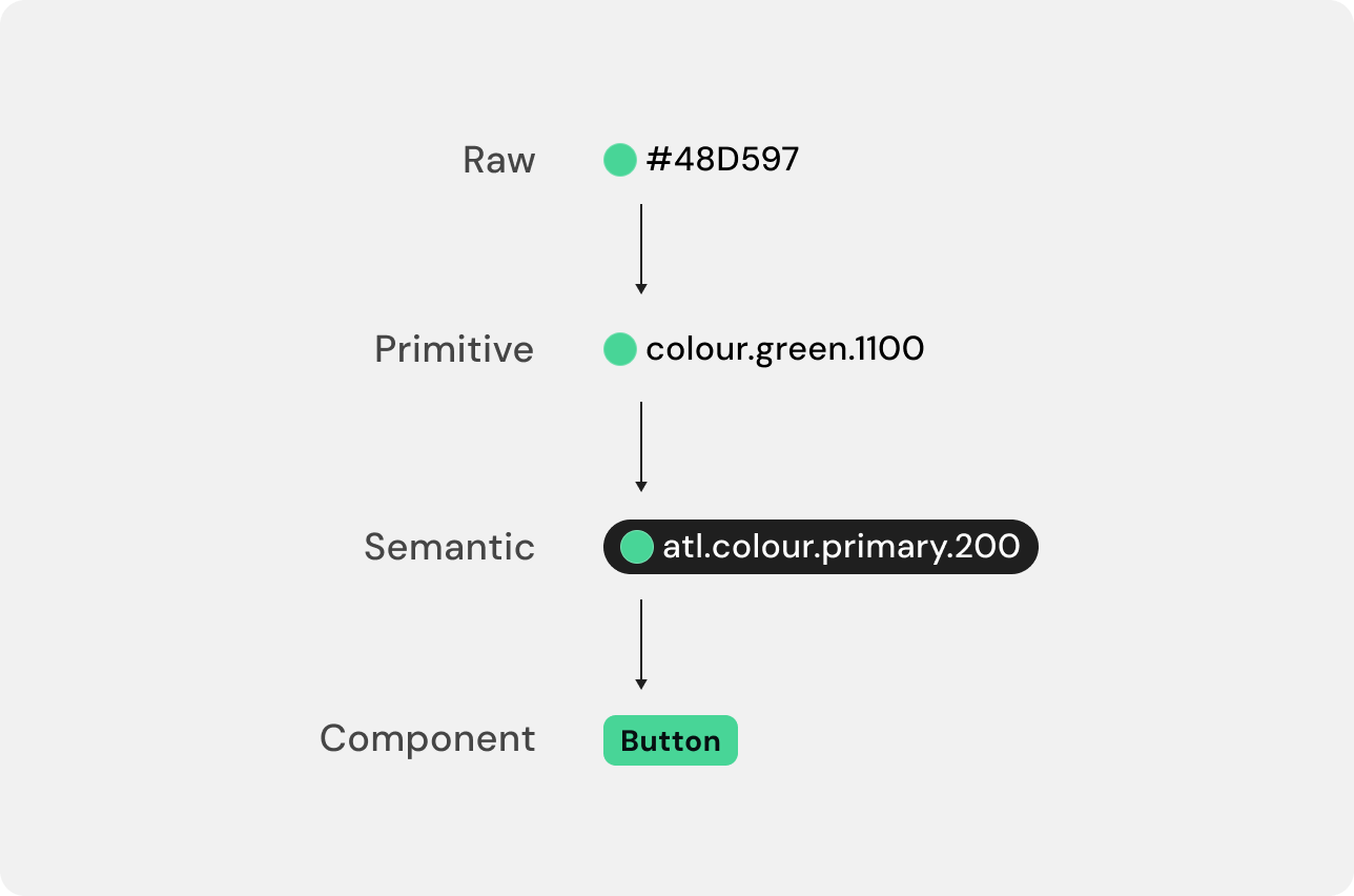
Rather than reorganizing colours, we redesigned the architecture around semantic intent. Our goal was for designers to choose tokens based on what an element represented instead of its visual appearance.
3. Designing around intent instead of colour
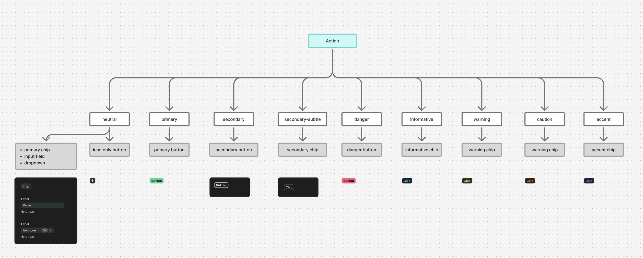
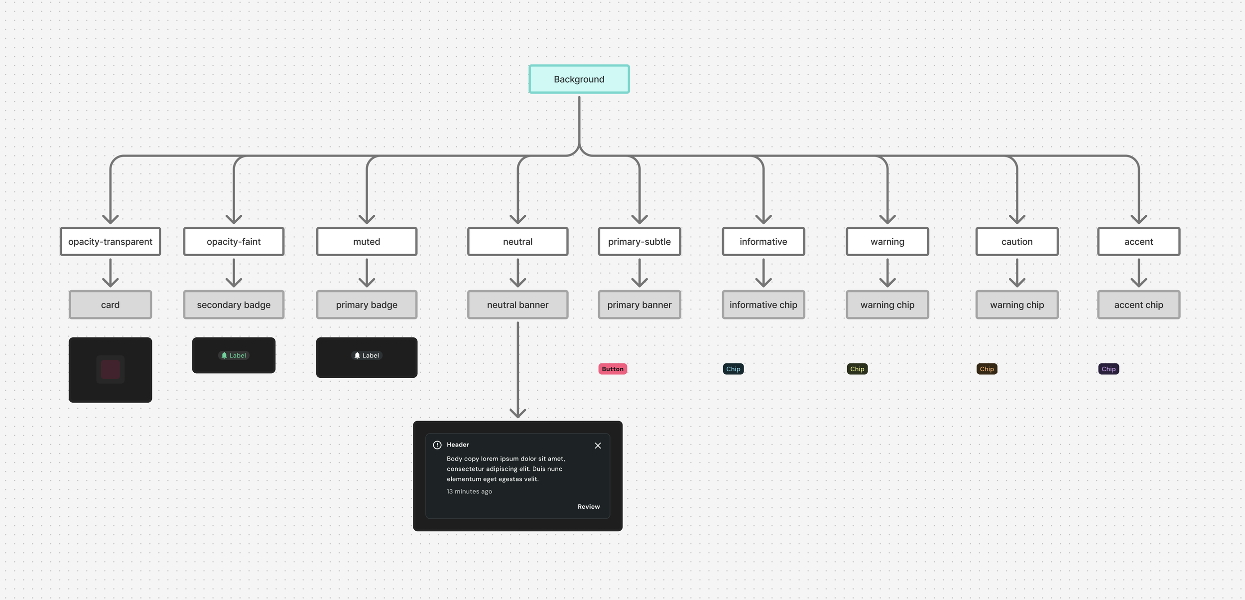
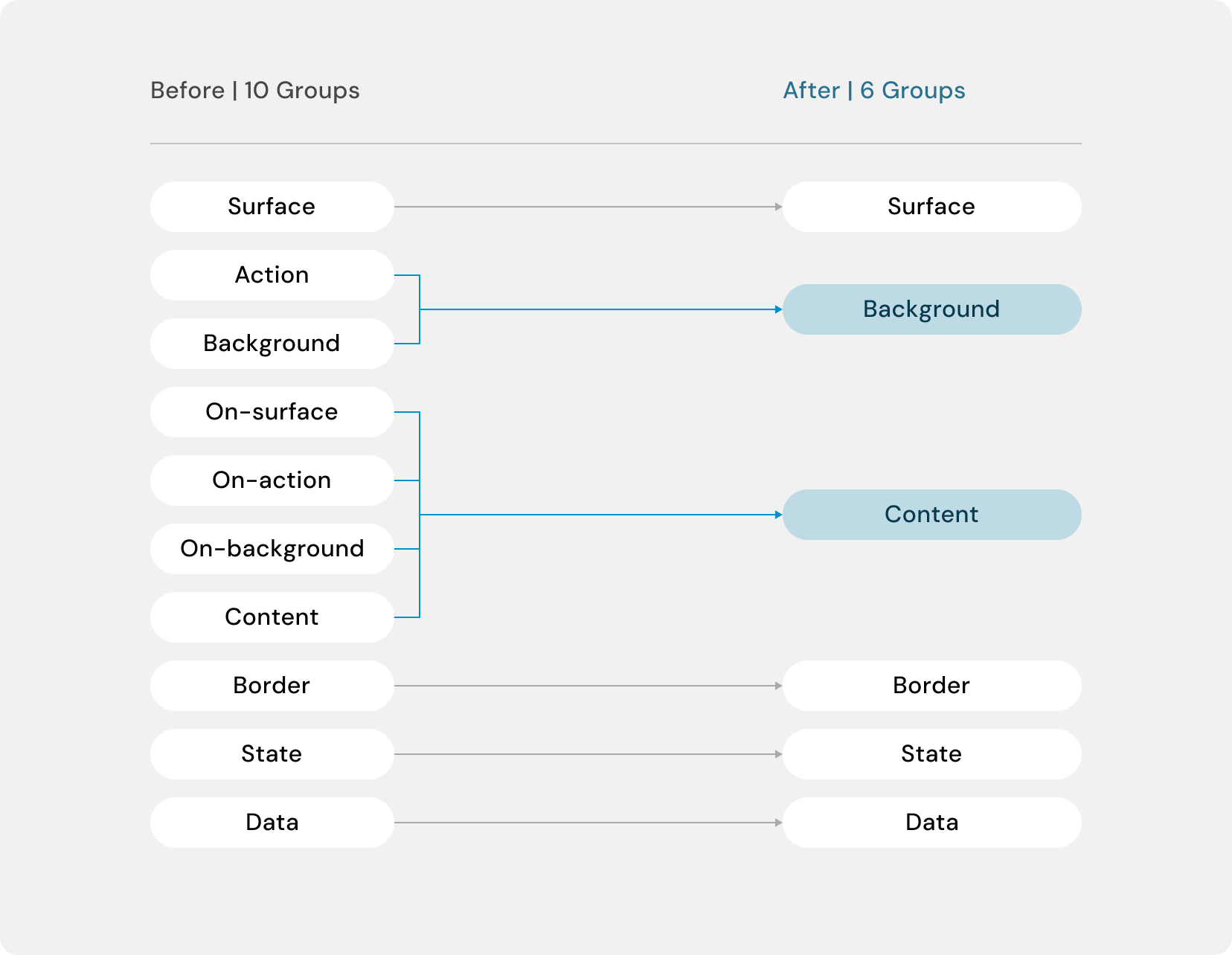
Before choosing colours, we grouped UI elements by what they do. Without colour to distract us, duplicates became obvious.
Action and Background were both fills, so they became Background. The "On-" groups were all text and icons, just named after what they sat on, so they merged into Content.
10 groups became 6.
This process not only improved clarity but also made the architecture easier to maintain as Atlas continues to evolve.
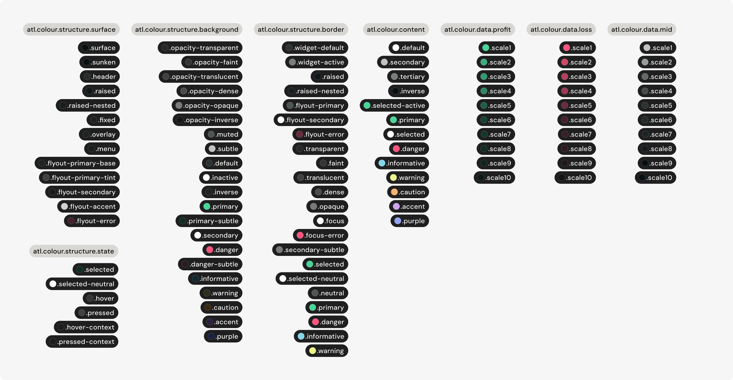
3. Aligning with the Brand Design System
We collaborated with Questrade's Brand Design System team to align terminology and semantic structures across both systems. As designers began working across multiple products, this consistency reduced context switching and made it easier to move between design systems.
Handling edge cases
Not every element fit neatly into the new semantic structure.
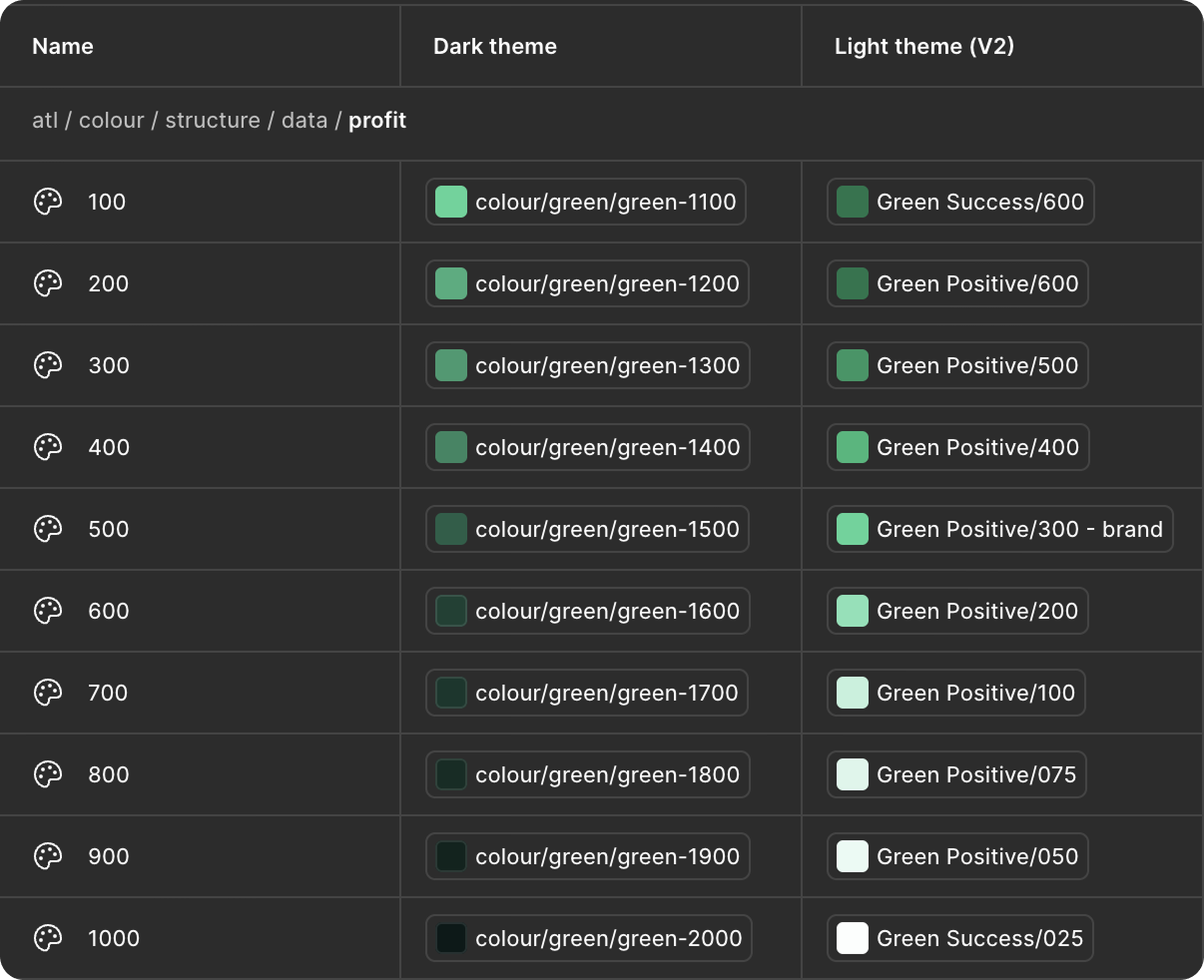
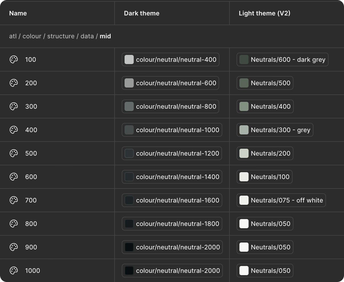
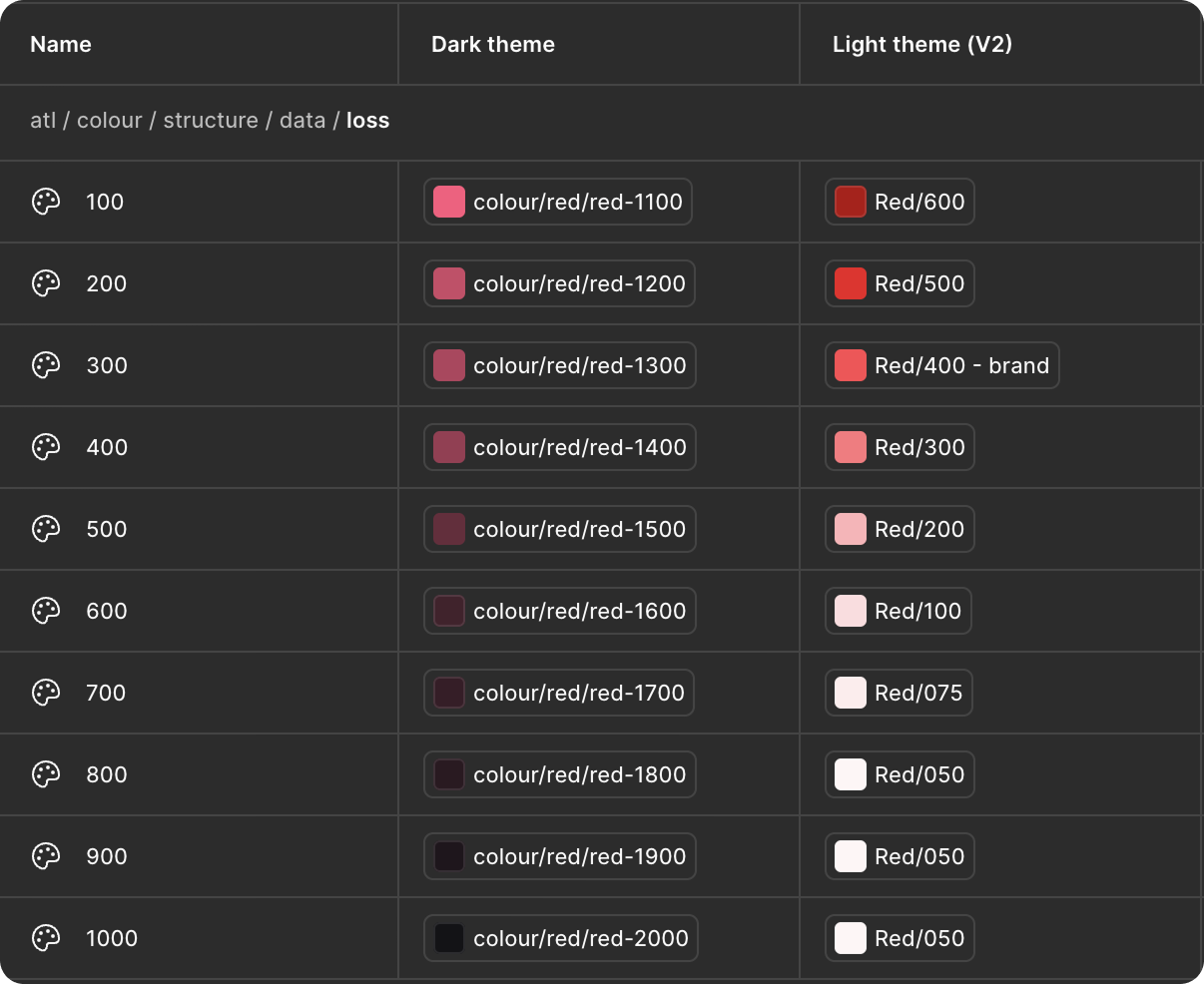
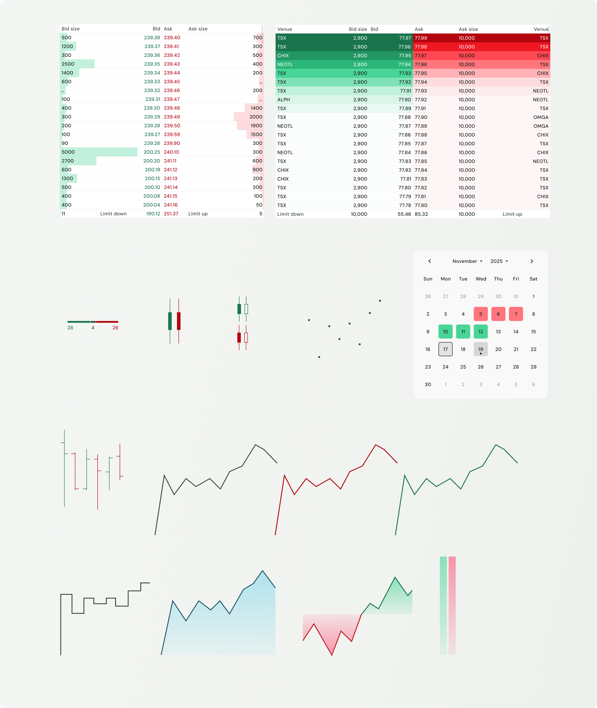
Financial data visualizations including gain, loss, break-even colours, gradients, and colour scales, required additional consideration because their meaning depended on context rather than interface purpose.
Rather than forcing these into the architecture prematurely, we organized them into scalable groups and planned to revisit them alongside future component refinements, allowing the semantic foundation to remain clean while supporting future evolution.
Impact
The redesigned semantic architecture established a stronger foundation for Atlas to scale beyond a single theme.
Key outcomes included:
Established a scalable semantic token architecture capable of supporting future themes.
Reduced ambiguity through meaningful, purpose-driven token naming.
Improved consistency across components by consolidating shared semantic concepts.
Aligned Atlas more closely with Questrade's Brand Design System to improve cross-product consistency.
Delivered a production-ready architecture that was successfully handed off to engineering for implementation.
Reflection
The biggest takeaway wasn't how to build a light theme, it was recognizing when a feature request is really an architecture problem. Investing in the semantic foundation first created a more scalable system while reducing complexity for everyone who designs and builds with Atlas.