Atlas Design system: Questrade Pro
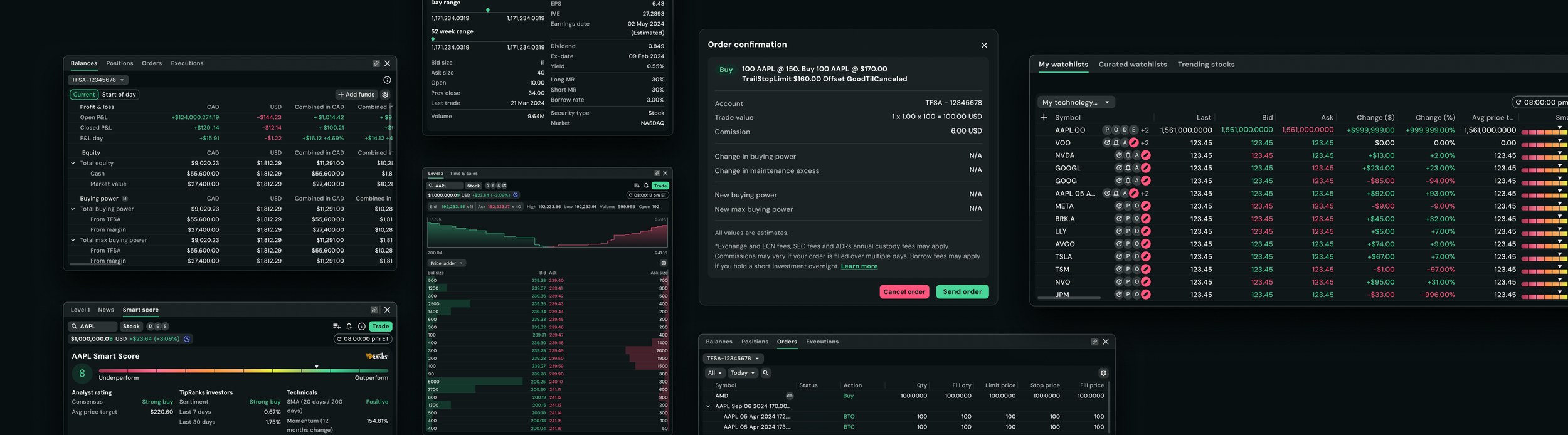
Questrade Pro is a trading platform designed for active traders managing high volumes of market data in fast-paced environments. The experience needs to support dense information, rapid decision-making, and scalable workflows across the platform.
Atlas, the design system built for Questrade Pro, supports the product’s compact and data-heavy UI requirements. As part of the product design team, my focus is on evolving the system to improve clarity, consistency, and scalability across the platform.
Product designer
Design system designer
Role
Platform
Web
Atlas - Background story
For engineers to build this platform quickly, the team took Questrade’s core design system called AllSpark and reskinned their components using Questrade Pro’s typography, colours, and spacing.
4 UI designers collaborated on the design system documentation while working closely with UX designers as widgets were being developed in parallel. With multiple contributors shaping the system at the same time, continuous refinement became important for improving consistency, scalability, and reducing cognitive load within components and variants.
Soon, our system became independent.
My role
A large part of my role involves designing and evolving components to be reusable, scalable, and flexible.
When creating components, I focus heavily on the logic and structure behind them, defining what should be required vs optional, how components adapt across different scenarios, and how they behave within dense trading workflows.
Defining scalable component architecture and variant structures
Identifying which atoms are essential vs optional based on UX needs and use cases
Designing components to support flexibility without introducing unnecessary complexity
Establishing behavioural rules such as scrolling and resizing
Defining minimum and maximum usage constraints to maintain consistency across the product
This includes:
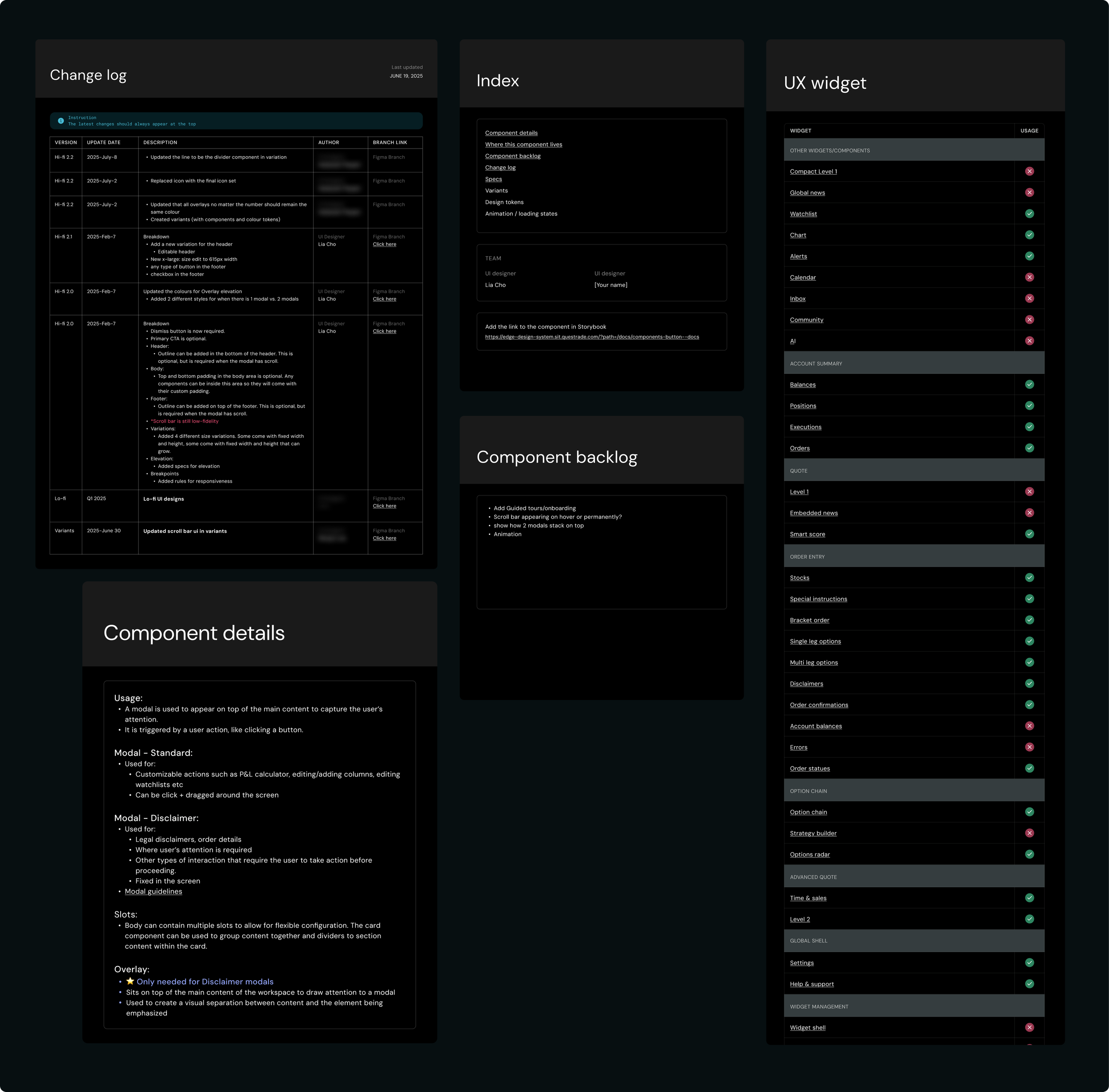
We create detailed documentation that outlines:
component anatomy and structure
available variants and configuration
usage guidelines and edge cases
interaction and behaviour patterns
layout and scaling considerations
Along with the documentation on specs, the team also collaborates on logging changes, an index with links to storybook, where the components live, component backlogs and component details.
The Challenge
Designing for a trading platform introduced multiple challenges:
Designers are navigating complex component variants
Status colours needed to have standardized meanings across the product
Component usage patterns were inconsistent between the designers
The token structure was not prepared to scale across future themes and view modes
System Priorities
My focus is on improving both the system architecture and the usability of the experience for designers and end users by:
Reducing cognitive load within component variants
Defining semantic rules for status colours and UI behaviours
Standardizing component usage patterns across the platform
Restructuring the token system to support future scalability
Exploring ways AI can reduce the time and effort spent on documentation
This work is ongoing and continues to evolve alongside the platform.
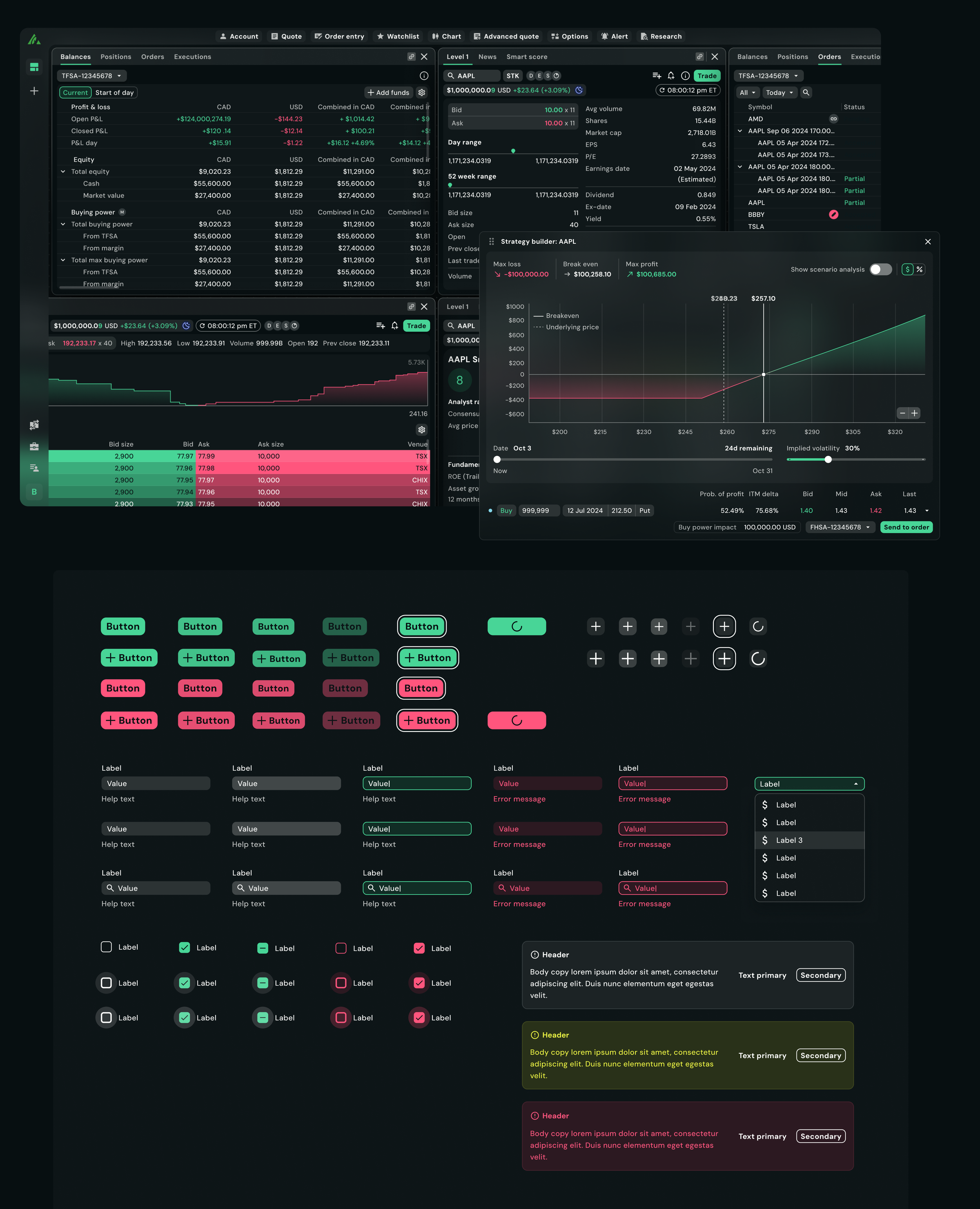
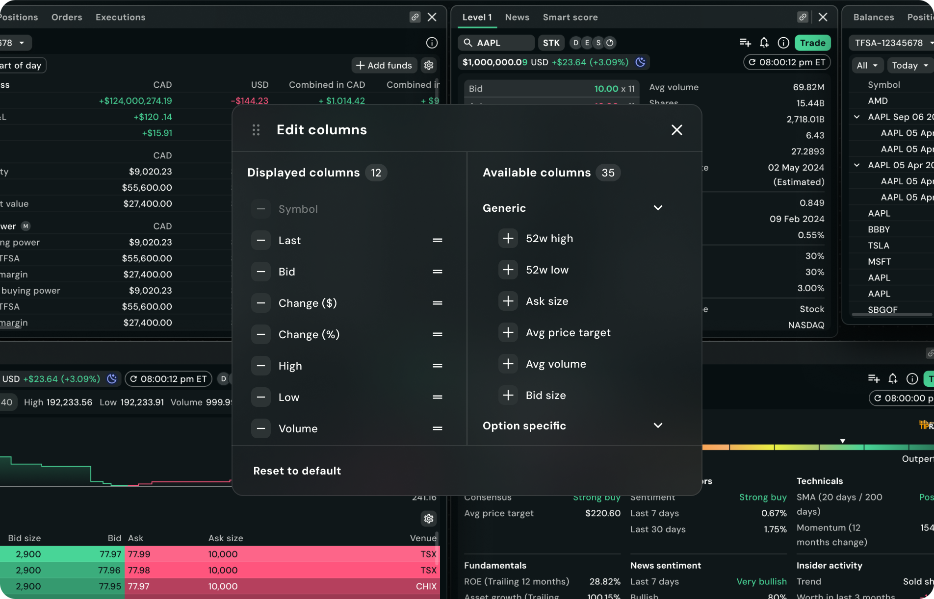
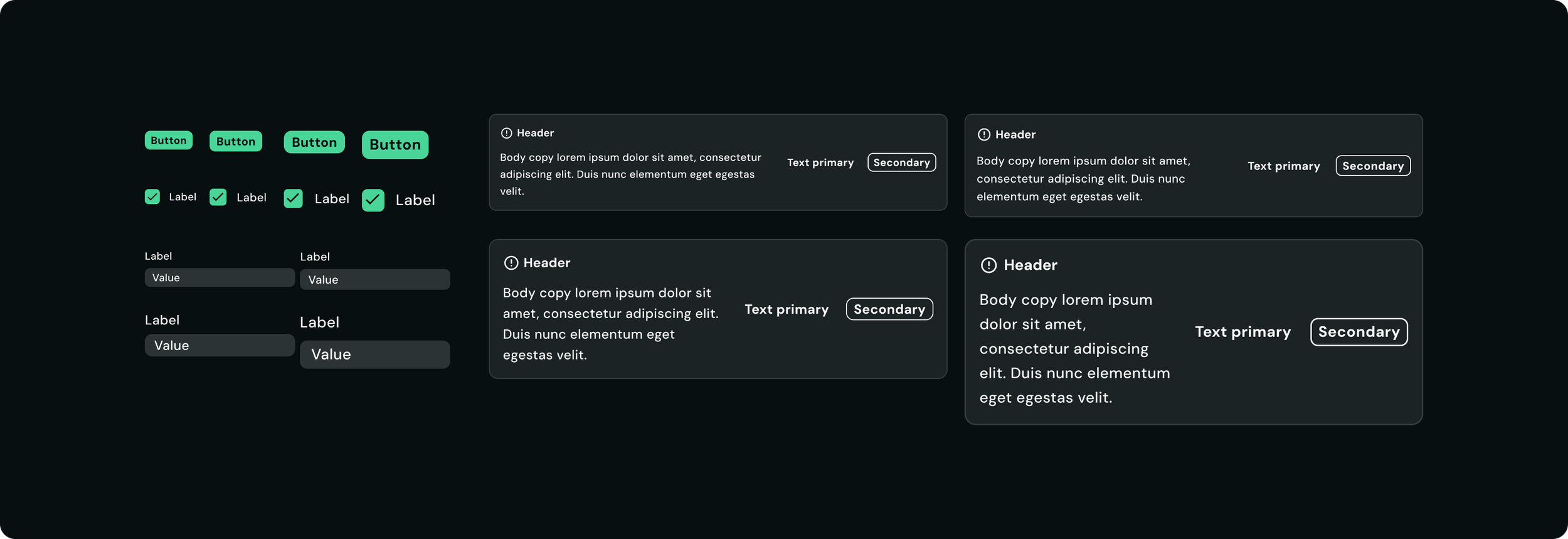
Variants - Reducing cognitive load
As the system expands, component variants became difficult to navigate and maintain. I ran user testings with designers to review certain components that were painful to use and reorganized the variant properties into clearer, more logical structures to improve discoverability and reduce confusion for designers.
This helps streamline workflows by making components easier to scan, understand, and apply consistently across product surfaces.
Key Improvements
Reorganized variant properties into more intuitive groupings
Simplified naming structures for clarity and scalability
Reduced unnecessary complexity in component configuration
Before
Updated
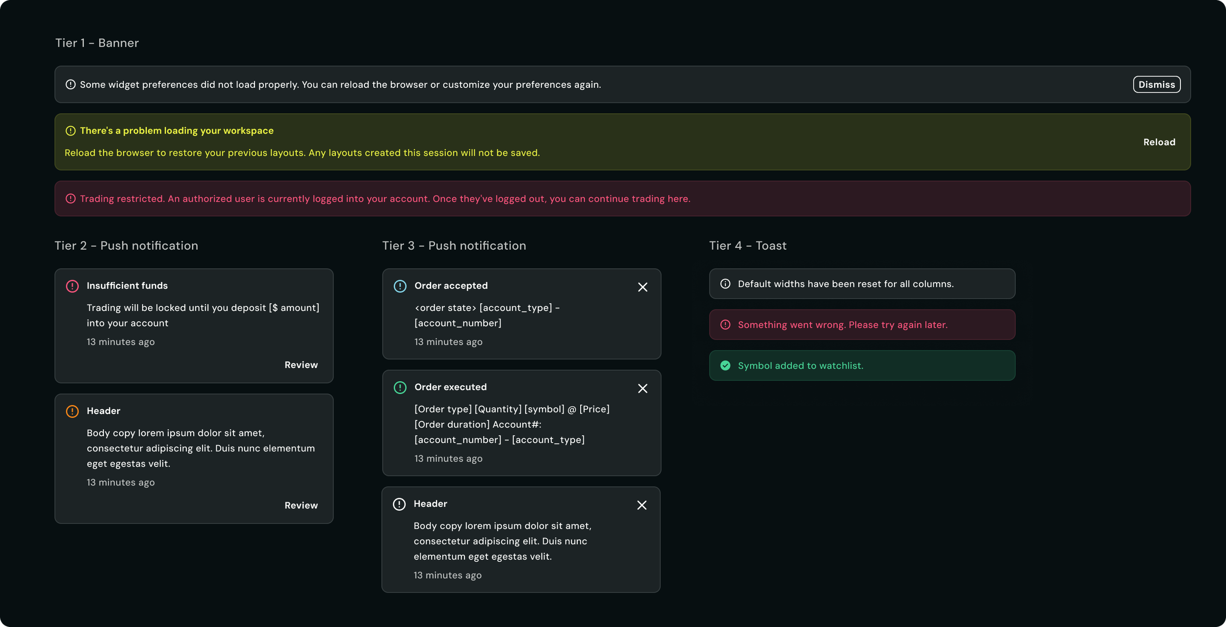
Defining semantic status colours
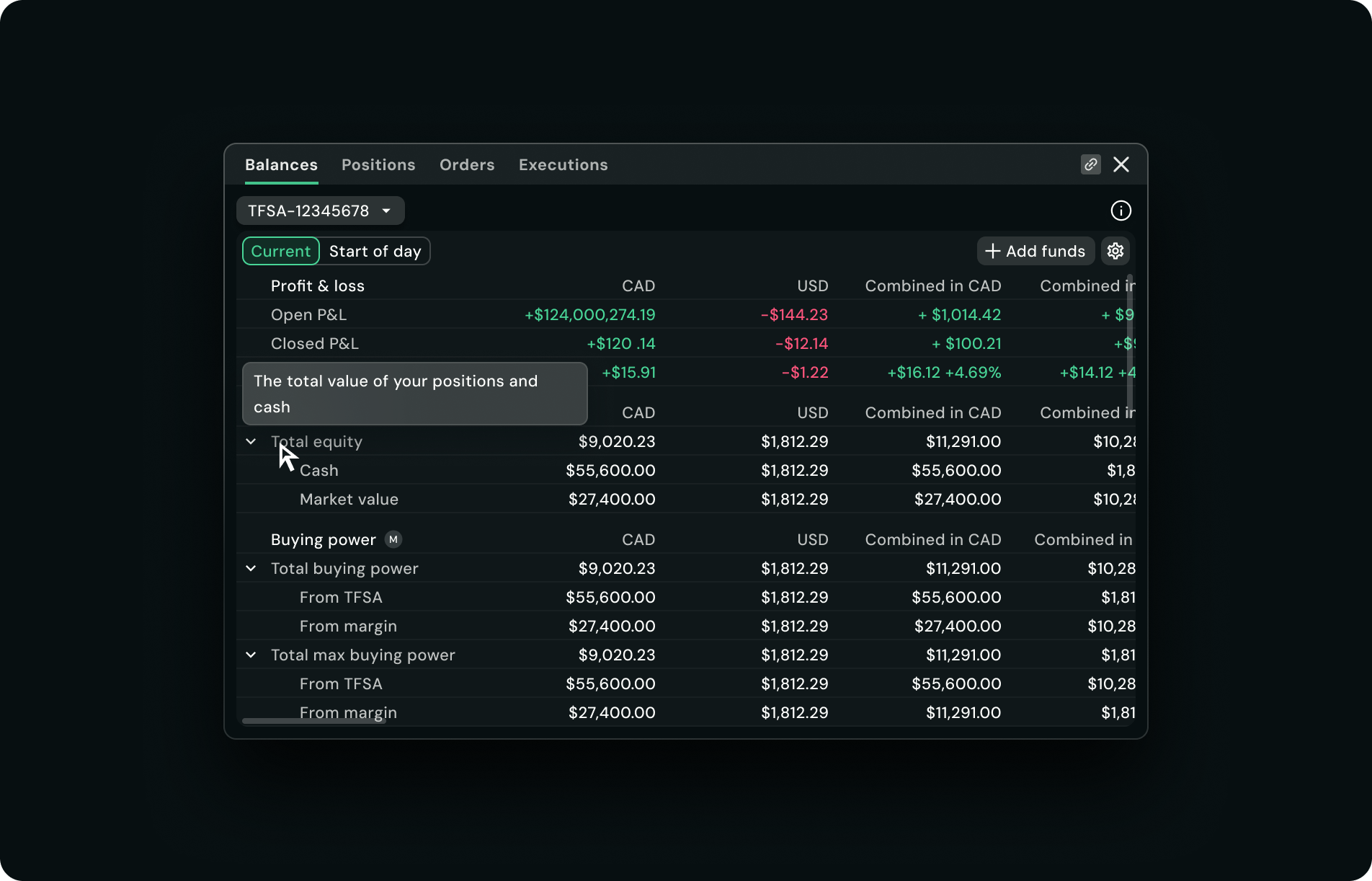
In a trading platform, status communication needs to be immediate and unambiguous. Semantic definitions and usage rules for status colours were defined to ensure consistency across the experience.
Rather than treating colours as visual styles alone, we defined them based on meaning and behaviour within the product.
Standardizing component usage
As Atlas evolved, there were a couple of inconsistencies caused by unclear component definitions and overlapping use cases. To improve consistency across the platform, I focused on clarifying component responsibilities, defining usage rules, and reducing ambiguity for both designers and engineers.
This includes:
Clarifying when components should and should not be used
Defining behaviour patterns across different components
Aligning UI patterns across workflows
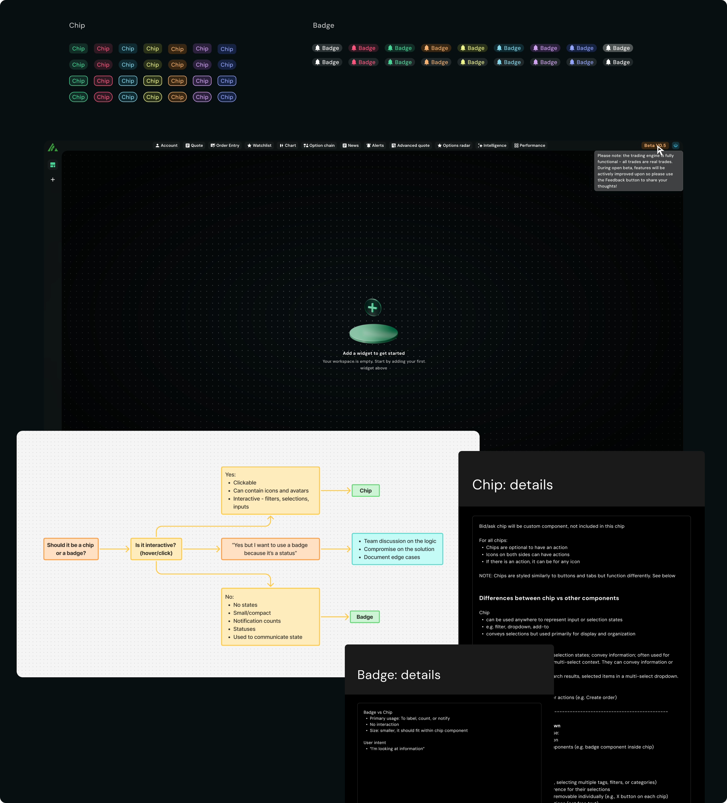
Case study #1 - Chip vs Badge
Both chips and badges supported colour variations, which sometimes blurred the distinction between their intended purposes.
Chips were designed as interactive elements used for actions such as filtering, selection, and input. Badges, on the other hand, served as non-interactive indicators used to communicate status.
One edge case came up when the product managers wanted to display a "Beta" status within the global navigation. While a badge was the most semantically appropriate choice, the design required a tooltip on hover to provide additional context. Because badges were intentionally defined as non-interactive, we ultimately used a chip to support the required interaction.
This example reinforced the importance of establishing clear component responsibilities while recognizing that occasional exceptions may be necessary to support user needs.
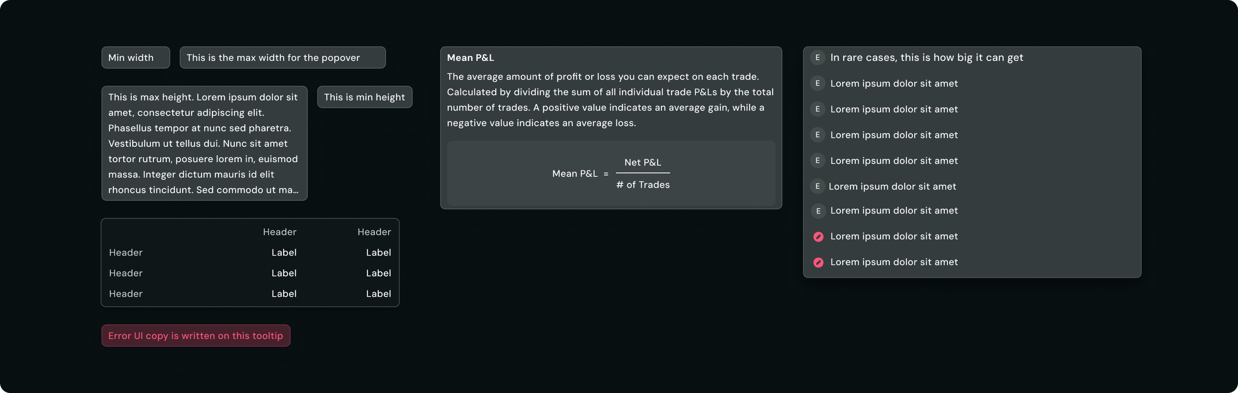
Case study #2 - Tooltip vs Popover
When Atlas was initially built on top of AllSpark, technical constraints resulted in the tooltip and popover being combined into a single component called "Popover."
While this simplified implementation, it created confusion within the design team in the end . The sizing and content rules we had defined were based on tooltip behaviour so designers frequently questioned how those rules should apply when the component was being used as a popover.
After Atlas became more independent from AllSpark, I worked with the team to separate the two components and establish clear guidelines for each. This allowed us to define distinct behaviours, content expectations, and sizing rules while eliminating the need to maintain conflicting guidance within a single component.
Before
Updated
Usage:
For quick identification/explanation
Only for short sentences
Can ONLY have copy
CANNOT have interactive elements
Should not be scrollable
Tooltip
Usage:
When complex details are required
Content should be long and in-depth details
Customizable
Can contain titles and interactive elements such as buttons, links, forms, tables etc
Can be scrolled
Popover
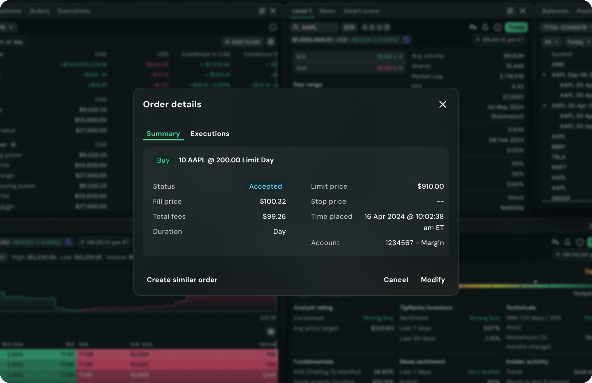
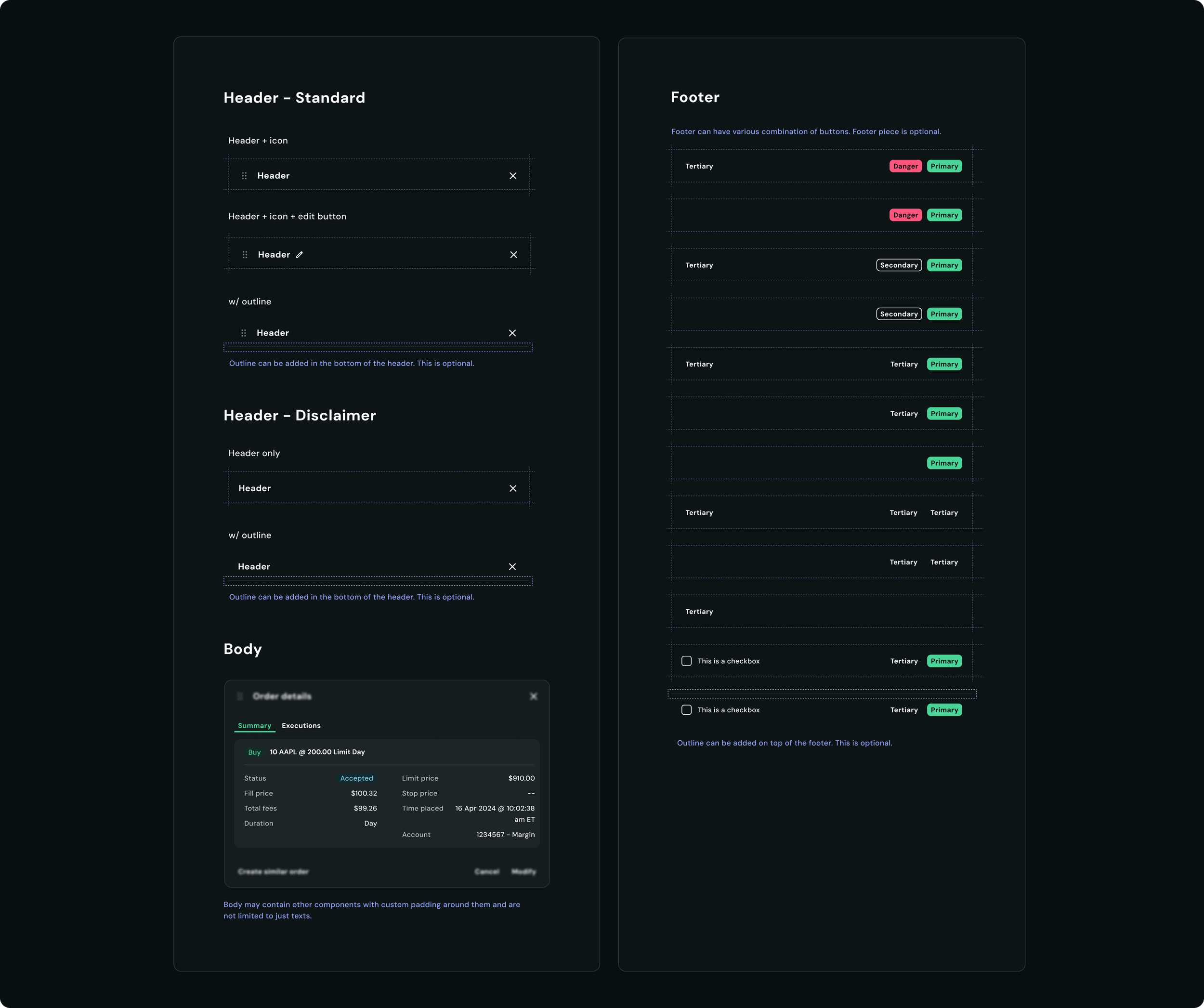
Case study #3 - Draggable Popover vs Modal
As new workflows were introduced, designers created a custom "draggable popover" pattern that launched from within a widget. While it visually resembled a modal, it differed in two key ways: it could be dragged around the interface and it did not include a background overlay.
Rather than introducing a new component, I saw an opportunity to extend the existing modal pattern. By treating drag functionality and overlays as configurable behaviours, we could support both use cases within a single scalable component.
I proposed evolving the modal component to have 2 variations, a standard and a disclaimer option to support drag interactions and optional overlays, allowing it to accommodate a wider range of workflows without increasing system complexity. The team responded positively to the approach, as it reduced component duplication while preserving flexibility for future use cases.
Updated
Usage:
Customizable actions such as editing/adding columns, editing watchlists etc
Can be click + dragged around the screen
Standard
Usage:
Legal disclaimers, order details,
Where user’s attention is required
Other types of interaction that require the user to take action before proceeding.
Fixed in the screen
Disclaimer
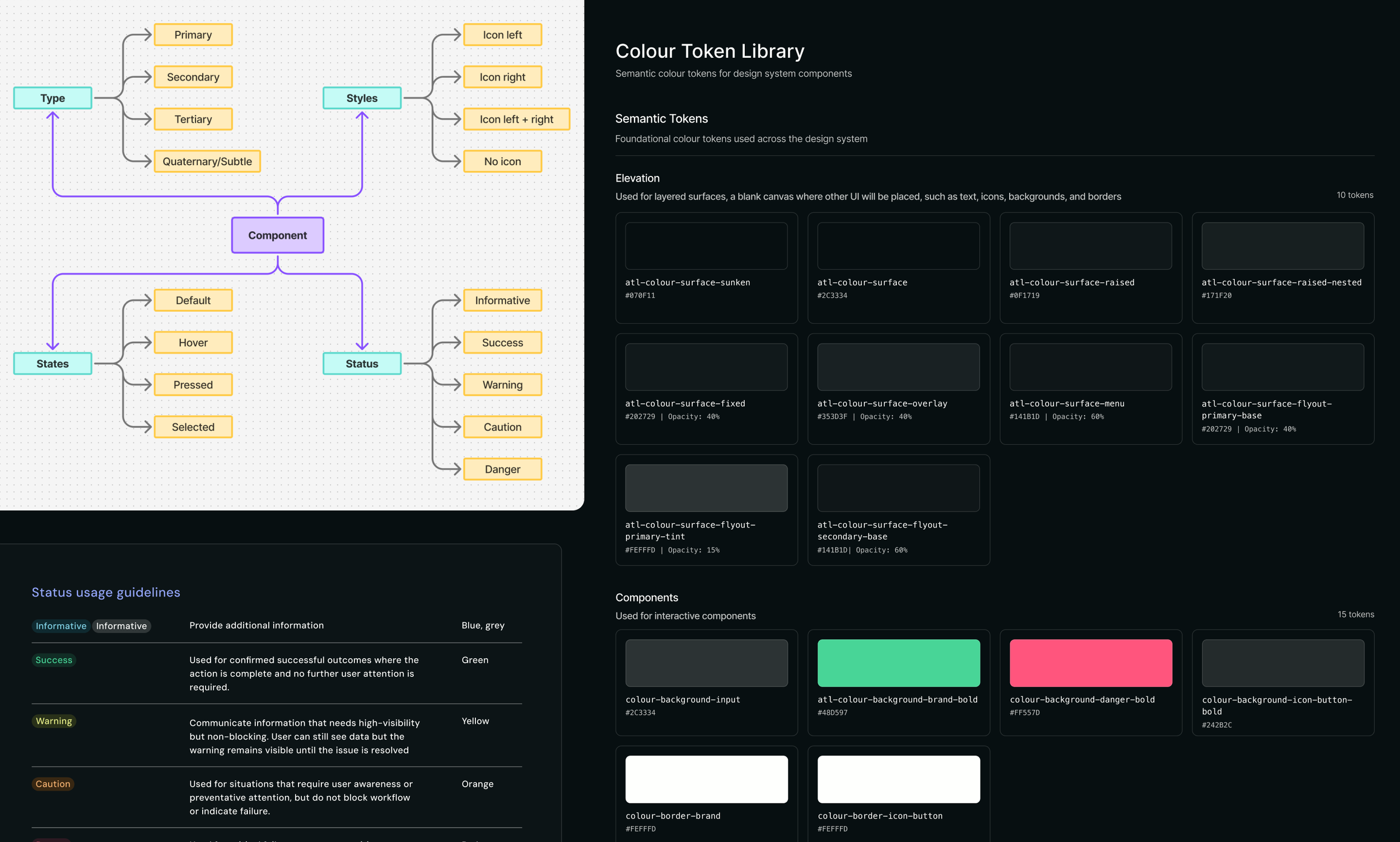
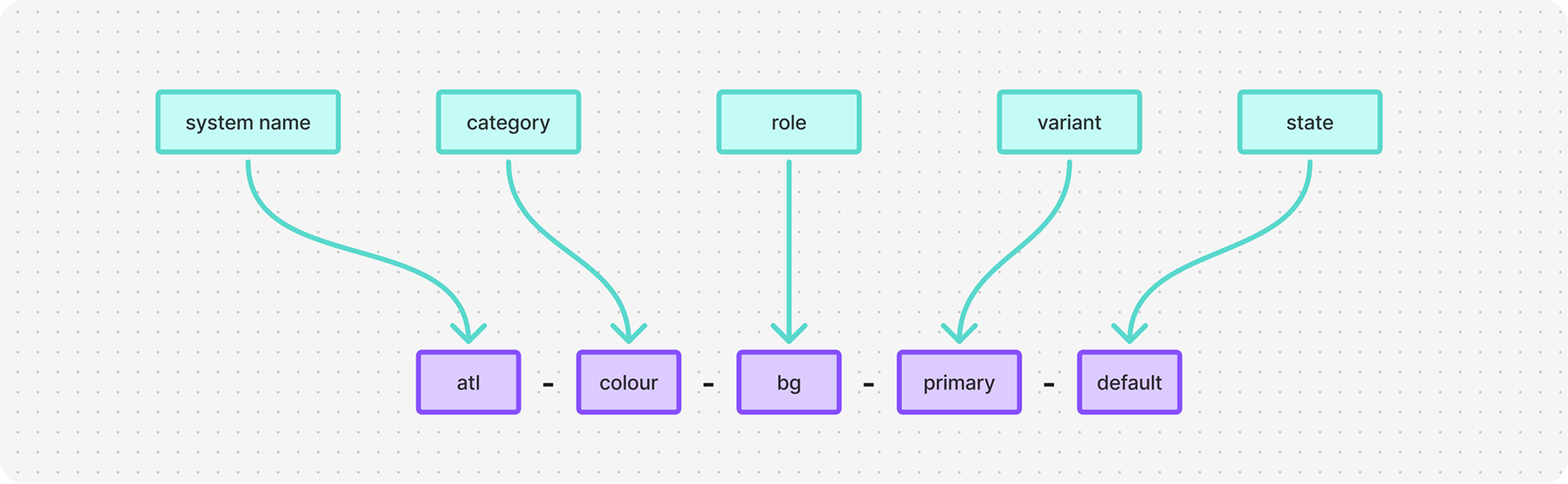
Restructuring the semantic token system
The semantic sizing token system we inherited from AllSpark is not scalable and the semantic naming system for the colours were difficult for designers to understand where they should be used.
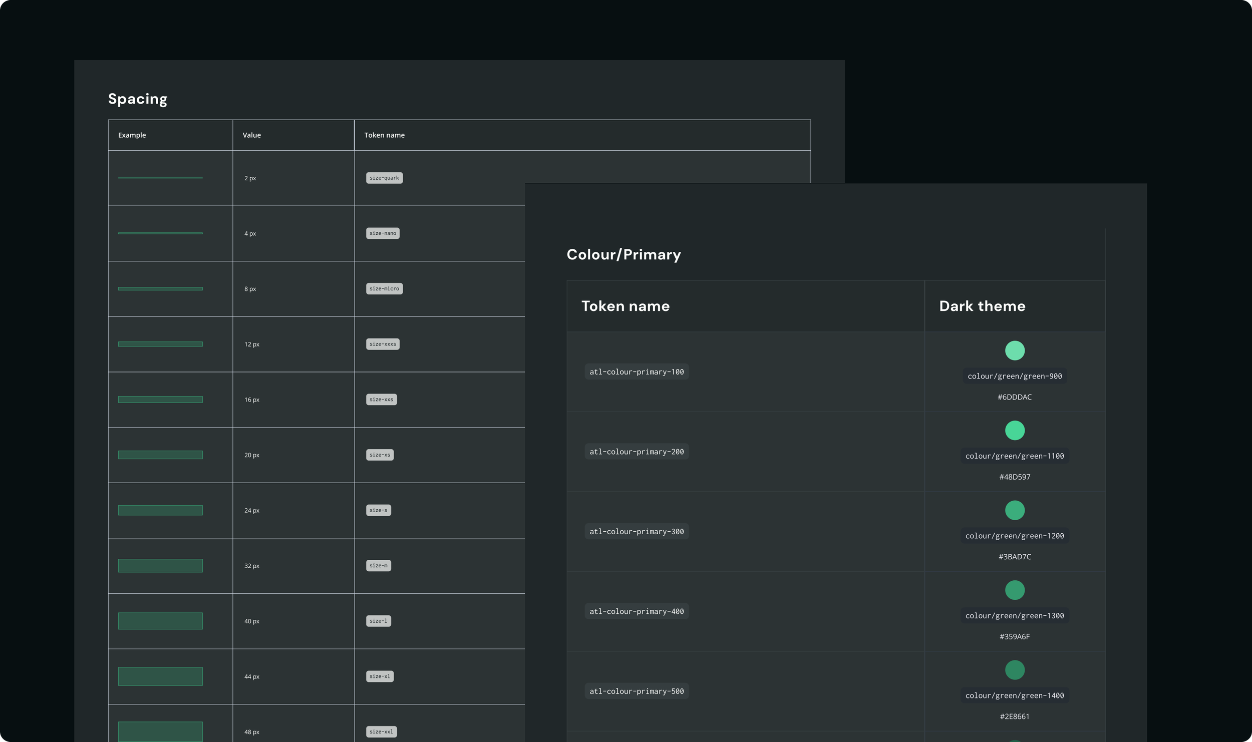
The updated structure will cover:
Multiple view modes (compact, default, large UI)
Light and dark themes
More scalable design-to-development implementation
This foundation enables the platform to evolve without requiring large-scale system rewrites in the future.
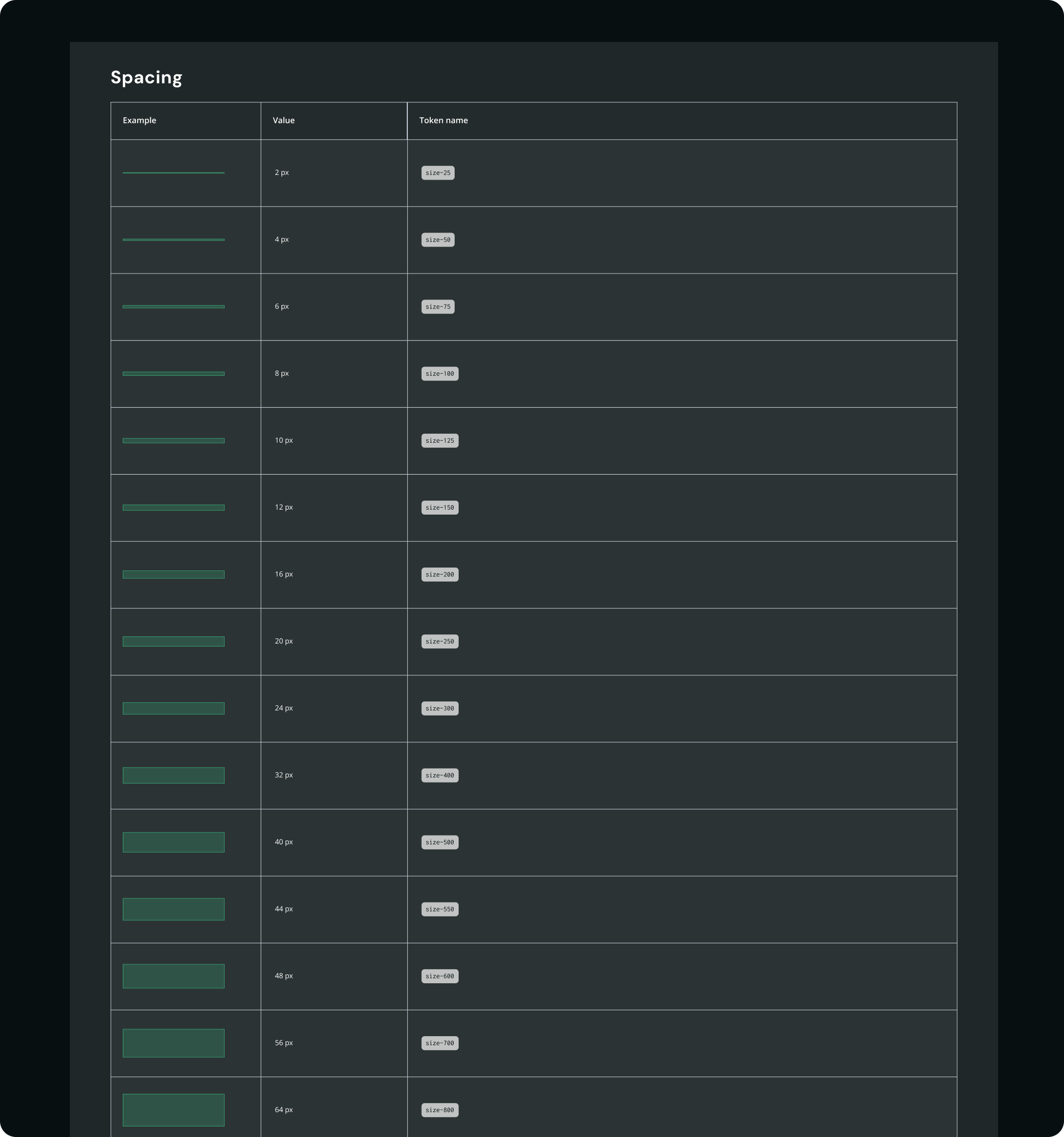
Semantic spacing tokens - work in progress:
View modes
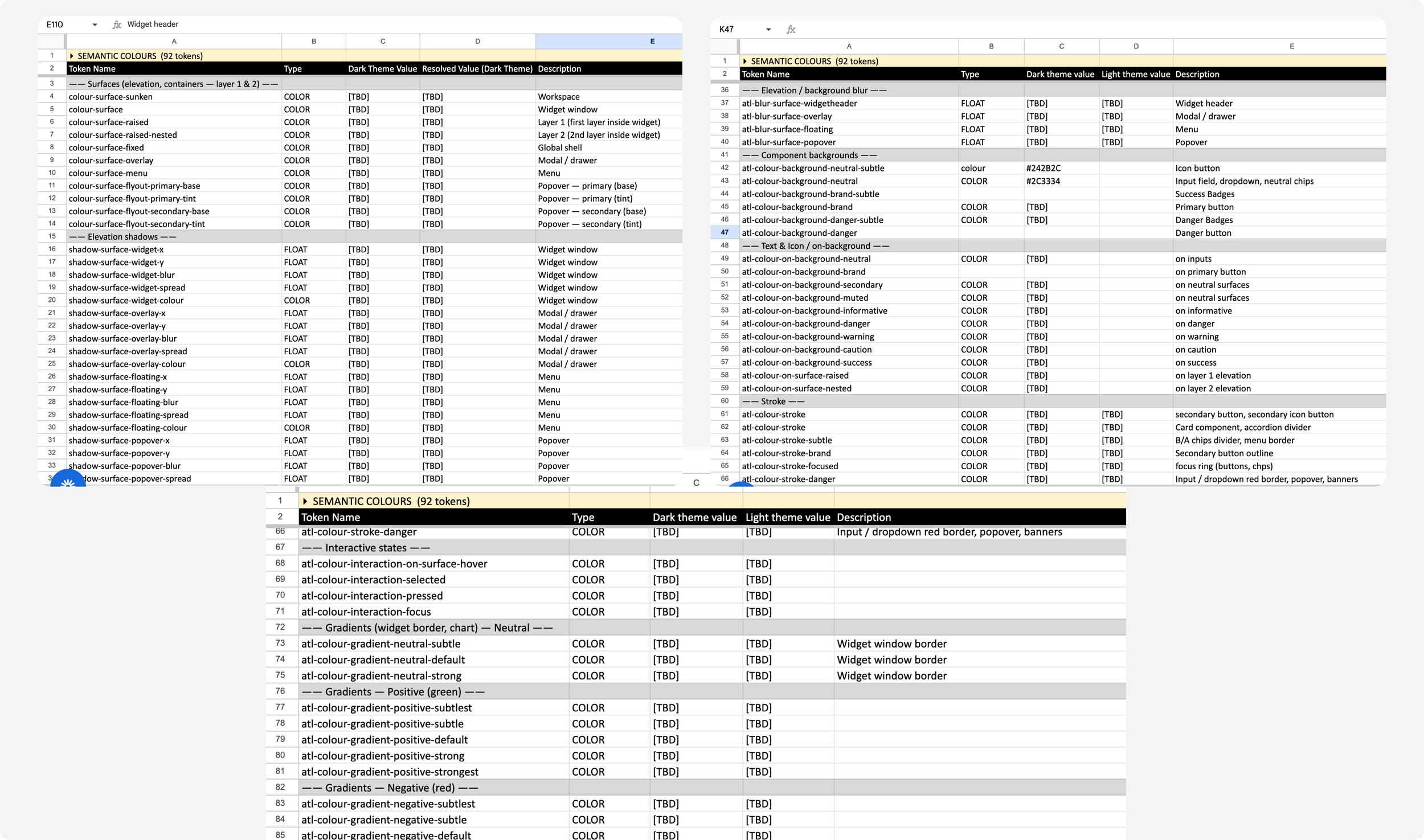
Semantic colour tokens - work in progress:
AI integration
My team and I are exploring ways to integrate AI into the design system workflow to reduce repetitive documentation work and make system maintenance more efficient and scalable. One of the ways that we’ve discovered is using Cursor to code a Design System Hub. This is still in the exploring stage.
Impact
Although the work is ongoing, these improvements helped the product
increase consistency across the platform
improve efficiency when designing with complex components
reduce the need for designers to detach components when creating new experiences
reduce ambiguity in system usage
create a stronger foundation for future scalability and theming
Reflection
Working on Questrade Pro shifted my focus beyond visual consistency to the logic behind components, the UX of variants, and building systems that help teams work more efficiently as the product grows.